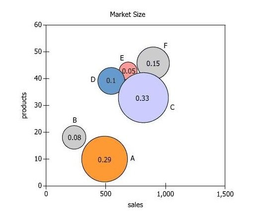
The six regions in which Techtyx Appliance Company sells appliances are labeled A through F in the graph. The size...
GMAT Graphics Interpretation : (GI) Questions

The six regions in which Techtyx Appliance Company sells appliances are labeled A through F in the graph. The size of each circle and the corresponding number in the circle indicate the proportion of Techtyx customer transactions in that region. The position of each circle's center relative to the vertical axis shows how many different product types are marketed in the region, and the position relative to the horizontal axis shows last year's sales in thousands of euros for the region.
For each of the following, use the drop-down menu to create the most accurate statement on the basis of the information provided.
Owning the Dataset
Table 1: Text Analysis
Text Component | Literal Content | Simple Interpretation |
---|---|---|
Company | "Techtyx Appliance Company" | The dataset is about a company called Techtyx. |
Geographic scope | "Six regions in which Techtyx Appliance Company sells appliances are labeled A through F in the graph." | There are six main regions analyzed, named A-F. |
Circle size and number | "The size of each circle and the corresponding number in the circle indicate the proportion of Techtyx customer transactions in that region." | Larger circles and higher numbers = more transactions. |
Vertical axis | "The position of each circle's center relative to the vertical axis shows how many different product types are marketed in the region." | Higher on the y-axis = more types of products offered in a region. |
Horizontal axis | "The position relative to the horizontal axis shows last year's sales in thousands of euros for the region." | Further right on the x-axis = higher regional sales (in thousands of euros). |
Time reference | "last year's sales" | All sales data refers to the previous year. |
Table 2: Chart Analysis
Chart Component | What It Displays | Interpretation |
---|---|---|
Chart type | Bubble scatter plot, 6 points labeled A-F | Each bubble represents a region's sales, product range, and transaction share. |
X-axis | Sales (thousands of euros), ranging ~0-1500 | Sales revenue per region, higher means more sold. |
Y-axis | Number of product types (~0-60) | Shows how many different products were sold per region. |
Bubble size/label | Proportion of customer transactions: \(\mathrm{A(0.29), B(0.08), C(0.33), D(0.10), E(0.05), F(0.15)}\) | C has the largest transaction share, E the smallest. |
Notable bubbles | E is high in product range (~45) but only 5% of transactions; C is more central (~35 products, ~33% transactions, high sales) | Regions with more product range tend to have lower transaction share and vice versa. |
Pattern | Inverse relation between product range and transaction share | More diversity = fewer but likely higher-value transactions. |
Key Insights
- Region C accounts for the largest share of customer transactions (33%) but only has the 4th highest product diversity, suggesting it focuses on a narrower, more popular range.
- Region E is an outlier: it has the lowest transaction proportion (5%) but a high number of product types and substantial sales—indicating high-value or premium purchases in that region.
- There is an inverse relationship: regions that market more product types (E, F) tend to generate fewer transactions, possibly reflecting broader selection for a smaller audience or higher-value sales per transaction.
Step-by-Step Solution
Question 1: Product Type Ranking for the Region with the Most Customer Transactions
Complete Statement:
Among the six regions, the one with the most Techtyx customer transactions ranks [BLANK 1] in the number of product types marketed.
Breaking Down the Statement
- Statement Breakdown 1:
- Key Phrase: the one with the most Techtyx customer transactions
- Meaning: This refers to the region that has the highest proportion of customer transactions.
- Relation to Chart: The proportion of transactions for each region is indicated by both the bubble size and the numeric label inside the bubble.
- Important Implications: We need to identify which region's bubble has the highest transaction proportion number.
- Key Phrase: the one with the most Techtyx customer transactions
- Statement Breakdown 2:
- Key Phrase: ranks [BLANK 1] in the number of product types marketed
- Meaning: This asks for the position of that region in terms of how many different product types it sells, compared to other regions.
- Relation to Chart: The y-axis shows the number of product types each region markets (the higher, the more).
- Important Implications: We must visually rank the regions by their y-axis value to determine the correct ranking.
- Key Phrase: ranks [BLANK 1] in the number of product types marketed
- What is needed: We need to find out where the region with the most transactions ranks when ordering all regions by their number of product types marketed.
Solution:
- Condensed Solution Implementation:
First, identify which region has the highest transaction proportion. Then, compare that region's position on the y-axis (product types) to rank it among all regions. - Necessary Data points:
Region C has the highest transactions (0.33). Vertical positions (from highest to lowest product types) are: F, E, D, C, B, A.- Calculations Estimations:
Ranking by vertical positions, C is fourth from the top in product types marketed. - Comparison to Answer Choices:
If the options are (first, second, third, fourth), the correct answer is 'fourth'.
- Calculations Estimations:
FINAL ANSWER Blank 1: fourth
Question 2: Region with the Highest Average Transaction Value
Complete Statement:
The region for which the value of the average transaction was greatest is region [BLANK 2].
Breaking Down the Statement
- Statement Breakdown 1:
- Key Phrase: value of the average transaction
- Meaning: This is calculated as total sales divided by the proportion of transactions.
- Relation to Chart: Sales are read from the x-axis. Transaction proportions are the numbers inside the bubbles.
- Key Phrase: value of the average transaction
- Statement Breakdown 2:
- Key Phrase: was greatest
- Meaning: We are searching for which region produces the largest average transaction value.
- Relation to Chart: We need to compute (sales / proportion) for several regions and compare the results.
- Key Phrase: was greatest
- What is needed: We need to find out which region achieves the highest average transaction value (total sales divided by transaction proportion).
Solution:
- Condensed Solution Implementation:
For each region among the answer choices, divide that region's sales by its transaction proportion. Compare the results. - Necessary Data points:
From the chart: A (550, 0.29), C (900, 0.33), E (700, 0.05), F (850, 0.15).- Calculations Estimations:
A: \(\mathrm{550/0.29 ≈ 1896.6}\); C: \(\mathrm{900/0.33 ≈ 2727.3}\); E: \(\mathrm{700/0.05 = 14,000}\); F: \(\mathrm{850/0.15 ≈ 5666.7}\). - Comparison to Answer Choices:
Region E's value (14,000) is much higher than the others, so E is the answer.
- Calculations Estimations:
FINAL ANSWER Blank 2: E
Summary
Region C has the highest share of customer transactions but only ranks fourth in product types offered. Region E, with the smallest share of transactions, has the highest average transaction value, indicating fewer but significantly larger transactions.
Question Independence Analysis
The two blanks are independent. The first deals with which region leads in transactions and where it stands in product diversity. The second asks which region has the highest average transaction value, regardless of the first blank's answer.