Loading...

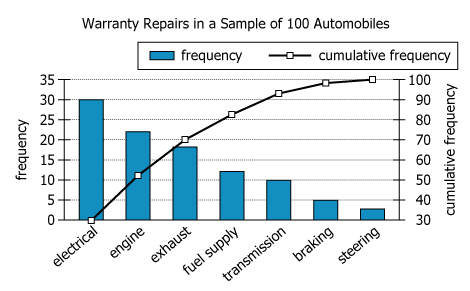
The graph summarizes data on a sample of 100 automobiles requiring warranty service within one year of purchase. Each automobile required service in exactly one of seven categories. For each category, the frequency is the number of automobiles in the sample requiring service in that category; the cumulative frequency is the total number of automobiles in the sample requiring service in that category or in any of the categories to the left in the graph. In the graph, the frequency scale is on the left and the cumulative frequency scale is on the right.
From each drop-down menu, select the option that creates the most accurate statement based on the information provided.
| Text Component | Literal Content | Simple Interpretation |
|---|---|---|
| Sample Size | "a sample of 100 automobiles" | 100 cars were surveyed |
| Time Frame | "requiring warranty service within one year of purchase" | Only first-year warranty repairs included |
| Single Category Constraint | "Each automobile required service in exactly one of seven categories." | Each car had only one type of repair |
| Repair Categories | "seven categories" | Repairs are categorized into seven groups |
| Definition: Frequency | "the frequency is the number...requiring service in that category" | Frequency = number of cars with that specific issue |
| Definition: Cumulative Freq. | "the cumulative frequency is the total number... in that category or in any...to the left in the graph" | Cumulative frequency = running total from left to current category |
| Scale Placement | "the frequency scale is on the left and the cumulative frequency scale is on the right" | Left axis shows counts, right axis shows cumulative percent |
| Chart Component | What's Shown | What This Tells Us |
|---|---|---|
| Chart Type | Combination of blue bars (frequencies) and black line with dots (cumulative) | Both count per category and running total as share of total repairs |
| Categories (X axis) | Seven ordered categories: electrical, engine, exhaust, fuel supply, ... | Categories are sorted left-to-right from most to least frequent |
| Left Y Axis | Frequency scale 0-35 | Number of repairs for each category is measurable |
| Right Y Axis | Cumulative frequency percentage 0-100% | See share of sample covered up to each category |
| Bar Heights | Electrical: 30, Engine: 22, Exhaust: 18, (others lower) | Three biggest categories dominate the total count |
| Cumulative Curve | Sharp rise up to 70% after 3rd category, then flattens | Top 3 categories cover 70% of all repairs |
| Order of Bars | Bars decrease left to right | The chart highlights most common to least common repairs visually |
Most warranty service needs in the first year are concentrated in a few problem types: the top three categories (electrical, engine, exhaust) account for 70% of all repairs, while the remaining four categories together account for only 30%. The visual pattern—a steep rise in the cumulative frequency line followed by a plateau—shows this concentrated distribution clearly. The chart's arrangement, with categories sorted by frequency, makes these patterns easy to identify.
Taken together, the 3 categories having the greatest frequencies account for ___% of the repairs in the sample.
Statement Breakdown 1:
Statement Breakdown 2:
What is needed: The percentage of all repairs represented by the three most frequent categories.
Taken together, the 3 categories having the lowest frequencies account for ___% of the repairs in the sample.
Statement Breakdown 1:
Statement Breakdown 2:
What is needed: The percentage of all repairs represented by the three least frequent categories.
To find the percentages, sum either the three largest or three smallest category frequencies. The top three categories total 70% of all repairs, as shown by the cumulative line. The bottom three combine to 17.5%, which rounds to 18%, matching the answer choices.
The questions are independent because each concerns a different, non-overlapping set of categories—solving one gives no information about the other.