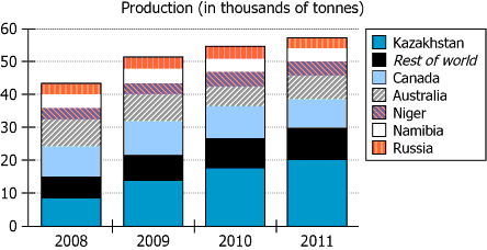
The graph shows the total amounts of a valuable mineral produced worldwide, in thousands of metric tons, from 2008 through...
GMAT Graphics Interpretation : (GI) Questions

The graph shows the total amounts of a valuable mineral produced worldwide, in thousands of metric tons, from 2008 through 2011. The graph also indicates what proportions of these totals were produced in each of the six top-producing nations and in the rest of the world.
Use the drop-down menus to create the statement that is most clearly supported by the information provided.
Owning The Dataset
Table 1: Text Analysis
Component | Detail |
---|---|
Subject | Total production amounts of a valuable mineral worldwide |
Units | Thousands of metric tons |
Time Range | \(\mathrm{2008}\) to \(\mathrm{2011}\) (inclusive) |
Geographic Coverage | Global (all countries), highlighting six top-producing nations and the rest of world |
Data Division | Separate production values for six nations and aggregated 'rest of world' |
Table 2: Chart Analysis
Aspect | Observation |
---|---|
Chart Type | Stacked bar chart, four bars (one per year: \(\mathrm{2008-2011}\)) |
Bar Segments | \(\mathrm{7}\) total: Kazakhstan, Canada, Australia, Niger, Namibia, Russia, Rest of world |
Y-axis | Ranges from \(\mathrm{0}\) to \(\mathrm{60}\) (thousand metric tons) |
Total Production | \(\mathrm{2008: 43}\), \(\mathrm{2009: 52}\), \(\mathrm{2010: 55}\), \(\mathrm{2011: 57}\) (all in thousand metric tons) |
Kazakhstan's Output | Rose rapidly: \(\mathrm{2008: 8}\), \(\mathrm{2009: 14}\), \(\mathrm{2010: 17}\), \(\mathrm{2011: 20}\) thousand metric tons |
Other Leading Countries | Australia: declined (\(\mathrm{9}\) to \(\mathrm{7}\)), Rest and others: little change (Canada, Niger, Namibia...) |
Key Insights
The data shows that global production of the mineral increased every year from \(\mathrm{2008}\) to \(\mathrm{2011}\), rising by \(\mathrm{14}\) thousand metric tons overall. Kazakhstan was responsible for nearly all this increase, more than doubling its output (from \(\mathrm{8}\) to \(\mathrm{20}\) thousand metric tons). Other leading producers' outputs were mostly stable, and Australia experienced a small decline. This indicates Kazakhstan emerged as the primary growth driver for global production during this period.
Step-by-Step Solution
Question 1: Determining the Scope of Production Changes
Complete Statement:
The changes in the total amounts of the mineral produced [in the entire world/in all nations other than the top producer/in all nations with declining production] from \(\mathrm{2008}\) to \(\mathrm{2011}\)...
Breaking Down the Statement
- Statement Breakdown 1:
- Key Phrase: changes in the total amounts
- Meaning: The differences in production quantities across years.
- Relation to Chart: Refers to the height of the total bar in each year (i.e., overall world total).
- Important Implications: Requires assessing the aggregate, not just individual or groups of countries.
- Statement Breakdown 2:
- Key Phrase: in the entire world/in all nations other than the top producer/in all nations with declining production
- Meaning: Each option specifies a different group of countries whose changes are being described.
- Relation to Chart: Need to compare total production versus various subgroups. 'Entire world' means the chart's total sum each year.
- Important Implications: Choosing the correct group is essential for answering the scope of change.
- What is needed: Which group of countries' data best describes the trend in total mineral production from \(\mathrm{2008}\) to \(\mathrm{2011}\).
Solution:
- Condensed Solution Implementation:
Compare the total mineral production values for the entire world in \(\mathrm{2008}\) and \(\mathrm{2011}\) to see the general change, then verify if this change is mainly due to the entire world's data or some subset. - Necessary Data points:
World total: \(\mathrm{2008}\) was \(\mathrm{43}\) thousand metric tons; \(\mathrm{2011}\) was \(\mathrm{57}\) thousand metric tons (an increase of \(\mathrm{14}\) thousand metric tons). - Calculations Estimations:
\(\mathrm{57 - 43 = 14}\); total increase is \(\mathrm{+14}\) thousand metric tons. - Comparison to Answer Choices:
Only 'in the entire world' accurately reflects the trend, as the other options do not account for the main change source.
FINAL ANSWER Blank 1: in the entire world
Question 2: Identifying the Country Most Responsible for Change
Complete Statement:
...are primarily reflective of changes in the amounts produced in [Australia/Canada/Kazakhstan/Russia].
Breaking Down the Statement
- Statement Breakdown 1:
- Key Phrase: primarily reflective of
- Meaning: Mainly due to; chiefly explained by.
- Relation to Chart: We look for the country with the change most similar in magnitude to the world's total change.
- Statement Breakdown 2:
- Key Phrase: changes in the amounts produced in
- Meaning: How each country's individual production changed over time.
- Relation to Chart: Compare country-wise segments in the bar chart.
- What is needed: Which country's production increase matches or explains most of the increase in world production.
Solution:
- Condensed Solution Implementation:
Examine each country's production in \(\mathrm{2008}\) and \(\mathrm{2011}\) to find the largest contributor to the world total's increase. - Necessary Data points:
Kazakhstan: \(\mathrm{8}\) (\(\mathrm{2008}\)) to \(\mathrm{20}\) (\(\mathrm{2011}\)); Australia: \(\mathrm{9}\) (\(\mathrm{2008}\)) to \(\mathrm{7}\) (\(\mathrm{2011}\)); Russia and Canada relatively unchanged. - Calculations Estimations:
Kazakhstan increase: \(\mathrm{12}\); total world increase: \(\mathrm{14}\); Kazakhstan accounts for almost all the world's growth. - Comparison to Answer Choices:
Kazakhstan stands out as the main source of greater production; other nations' changes are smaller or negative.
FINAL ANSWER Blank 2: Kazakhstan
Summary
Over \(\mathrm{2008-2011}\), world production of the mineral rose significantly, mainly because Kazakhstan's output increased dramatically (from \(\mathrm{8}\) to \(\mathrm{20}\) thousand metric tons). Kazakhstan was the main driver of the global increase.
Question Independence Analysis
These questions are closely linked: the first establishes we are looking at global changes, while the second asks which country caused that change, requiring information from the same data trend.