Owning the Dataset
Table 1: Text Analysis
| Text Component |
Literal Content |
Simple Interpretation |
| Subject |
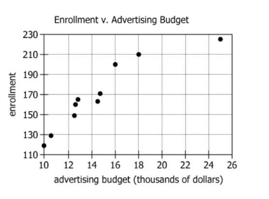
The graph shows the relationship between a child care center's advertising budget and its annual enrollment |
The chart compares ad spending with student enrollment |
| Timeframe |
Over the previous 10 years |
Data covers a decade |
| Variables |
Advertising budget, annual enrollment |
The two variables being tracked and compared |
| Revenue Statement |
Total revenue was \(\$1,890,000\), or \(\$9,000\) per child |
In a given year, with \(\$9,000\) charged per child, total revenue indicates how many students were enrolled |
Table 2: Chart Analysis
| Chart Component |
What Is Observed |
Explanation |
| Chart Type |
Scatter plot with ~10 data points |
Each dot is a year pairing ad budget with enrollment |
| X-axis |
Advertising budget (thousands of dollars), from 10 to 25 |
Amount spent on marketing, in thousands |
| Y-axis |
Enrollment, from 120 to 226 |
Number of students enrolled per year |
| Trend |
Positive/upward linear pattern |
Higher ad budget is strongly linked to higher enrollment |
| Matching Data Point |
210 enrollment at \(\$18k\) ad budget |
For a year with 210 students, \(\$18,000\) was spent on ads |
Key Insights
There is a strong positive correlation between the child care center's advertising budget and annual enrollment: larger ad budgets reliably match years with higher student counts. When revenue totaled \(\$1,890,000\) and each student paid \(\$9,000\), there were 210 students that year, which aligns to an \(\$18,000\) ad budget on the chart. Enrollment ranged from 120 to 226 in the period shown, indicating substantial growth linked to increased advertising.
Step-by-Step Solution
Question 1: Type of Correlation Between Advertising Budget and Enrollment
Complete Statement:
The graph indicates a [BLANK] correlation between advertising budget and enrollment at the child care center.
Breaking Down the Statement
- Statement Breakdown 1:
- Key Phrase: The graph indicates
- Meaning: We are being asked to interpret a visual trend shown in the graph.
- Relation to Chart: The graph displays points for advertising budget (x-axis) and enrollment (y-axis) across multiple years.
- Important Implications: We should analyze whether the plotted points show a particular direction or pattern.
- Statement Breakdown 2:
- Key Phrase: correlation between advertising budget and enrollment
- Meaning: Correlation describes the relationship between the two variables.
- Relation to Chart: Look for whether enrollment increases, decreases, or stays the same as advertising budget increases.
- Important Implications: A positive correlation means both values rise together, a negative means one falls as the other rises, and negligible means little to no relationship.
- What is needed: We need to determine if the data depicts a strong, weak, or negligible positive or negative correlation.
Solution:
- Condensed Solution Implementation:
Examine the scatterplot to see if the plotted points form a tight trend from bottom left to top right (strong positive), appear random (negligible), or drop from top left to bottom right (strong negative).
- Necessary Data points:
Pattern of data points on the scatterplot; clusters and direction relative to the axes.
- Calculations Estimations:
No calculations needed; only a visual assessment. The points are closely clustered along an upward line.
- Comparison to Answer Choices:
The scatterplot shows enrollment steadily rising as the advertising budget increases, with little scatter, indicating a strongly positive correlation.
FINAL ANSWER Blank 1: Strongly positive
Question 2: Advertising Budget for a Given Revenue Year
Complete Statement:
During one of the years depicted in the graph, the total revenue was \(\$1,890,000\), or \(\$9,000\) per child. In this year, the advertising budget was [BLANK].
Breaking Down the Statement
- Statement Breakdown 1:
- Key Phrase: total revenue was \(\$1,890,000\), or \(\$9,000\) per child
- Meaning: Each enrolled child brought in \(\$9,000\); thus, dividing total revenue by this amount gives enrollment for that year.
- Relation to Chart: We calculate the number of enrolled children to match a y-value on the graph.
- Statement Breakdown 2:
- Key Phrase: the advertising budget was [BLANK]
- Meaning: We are asked to find the amount spent on advertising for the year with the previously calculated enrollment.
- Relation to Chart: Find the corresponding x-value (advertising budget) for the year with the calculated enrollment on the graph.
- What is needed: Determine the advertising budget that corresponds to the year when enrollment was \(\$1,890,000 ÷ \$9,000\) per child.
Solution:
- Condensed Solution Implementation:
First, calculate the number of children enrolled using the revenue information. Next, use this enrollment value to identify the corresponding advertising budget from the graph or data.
- Necessary Data points:
Total revenue (\(\$1,890,000\)), revenue per child (\(\$9,000\)), calculated enrollment (210), and advertising budget amounts for each enrollment value.
- Calculations Estimations:
Enrollment = \(\$1,890,000 ÷ \$9,000 = 210\). Find the data point on the graph: when enrollment = 210, the advertising budget was \(\$18,000\).
- Comparison to Answer Choices:
Among the answer choices given (e.g., 10,000; 12,000; 16,000; 18,000), \(\$18,000\) is the correct match for 210 enrolled children.
FINAL ANSWER Blank 2: 18,000
Summary
For blank 1, the graph shows a strongly positive correlation between advertising budget and enrollment: the more spent on advertising, the more children enroll. For blank 2, dividing total revenue by per-child revenue gives 210 children; for that year, the advertising budget was \(\$18,000\) according to the graph.
Question Independence Analysis
Blank 1 and blank 2 are independent; one concerns the overall trend (correlation type), and the other focuses on a calculation for a specific year.
