Owning the Dataset
Table 1: Text Analysis
| Text Component |
Literal Content |
Simple Interpretation |
| Subject Matter |
the number of passenger cars sold |
Annual sales of passenger vehicles |
| Location |
Nation X |
Name not specified |
| Time Period |
each of the years 1965 through 2010 |
Yearly data for 46 years |
| Additional Feature |
as well as with a trendline for this data |
Chart includes linear trendline |
Table 2: Chart Analysis
| Chart Feature |
Details |
What This Tells Us |
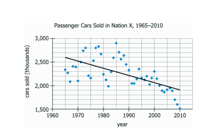
| Chart Type |
Scatter plot with trendline |
Shows variation and trend over time |
| X-axis |
Years 1965–2010 |
Covers 46 annual data points |
| Y-axis |
Cars sold (in thousands), approximately from 1,500 to 3,000 |
Sales range from 1.5M to 3M cars per year |
| Data Markers |
Blue diamonds, one per year |
Clear year-to-year fluctuations |
| Trendline |
Black linear, downward-sloping |
Sales decline over period |
| Peak |
Early 1980s, notably above the trendline by \(\sim 600,000\) cars |
Exceptional increase compared to other years |
| Rate of Decline |
Trendline from \(\sim 2,600,000\) (1965) to \(\sim 1,900,000\) (2010) |
Decline of about 700,000 cars in 45 years (\(\sim 15,500\) per year) |
Key Insights
- Sales of passenger cars in Nation X peaked in the early 1980s, reaching about \(600,000\) above the long-term trendline.
- The overall trend from 1965 to 2010 is a steady decline, with sales dropping by approximately \(700,000\) cars over 45 years (from \(\sim 2.6\) million to \(\sim 1.9\) million).
- Most annual sales figures lie between 1.9 and 2.7 million cars, with the lowest years near 1.5 million and the highest near 2.9 million.
- If the linear decline continues, sales projection for 2055 would be around 1.2 million cars, about \(700,000\) fewer than in 2010.
Step-by-Step Solution
Question 1: Measuring Peak Sales Above the Trend Line
Complete Statement:
For the year in which the greatest number of passenger cars was sold, that number was approximately [BLANK 1] greater than that indicated by the trend line.
Breaking Down the Statement
Statement Breakdown 1:
- Key Phrase: the year in which the greatest number of passenger cars was sold
- Meaning: Identify the year with the highest number of passenger cars sold.
- Relation to Chart: Look for the highest data point (blue diamond marker) on the scatter plot to find the year with peak sales.
- Important Implications: Determines which year's data and corresponding trend line value to use for the comparison.
Statement Breakdown 2:
- Key Phrase: that number was approximately [BLANK 1] greater than that indicated by the trend line
- Meaning: Find out how much the actual sales surpassed the trend line value that year.
- Relation to Chart: Estimate the vertical distance between the actual peak point and the trend line at the same year.
- Important Implications: A direct comparison between the sales number and the trend line at the peak year provides the answer.
What is needed: The approximate number of cars by which the peak sales exceeded the trend line value in the same year.
Solution:
- Condensed Solution Implementation:
Locate the peak sales year on the scatter plot and estimate both the peak sales value and the trend line value for that year.
- Necessary Data points:
Estimated peak sales (early 1980s): about \(2,900,000\); Trend line value at that year: about \(2,300,000\).
- Calculations Estimations:
\(2,900,000\) (peak) minus \(2,300,000\) (trend) equals \(600,000\).
- Comparison to Answer Choices:
\(600,000\) matches one of the answer choices, confirming the correct blank.
FINAL ANSWER Blank 1: 600,000
Question 2: Projection of Future Sales Using Trend Line
Complete Statement:
If the number of passenger cars sold follows the pattern of the trendline, approximately [BLANK 2] passenger cars will be sold in 2055.
Breaking Down the Statement
Statement Breakdown 1:
- Key Phrase: follows the pattern of the trendline
- Meaning: Assume that sales decline continues along the same linear trend shown.
- Relation to Chart: Work only with the black linear trend line, regardless of actual data points.
Statement Breakdown 2:
- Key Phrase: approximately [BLANK 2] passenger cars will be sold in 2055
- Meaning: Predict the value on the trend line at the year 2055, beyond the graphed years.
- Relation to Chart: Extend the linear trend line forward to 2055 to estimate projected sales.
What is needed: The estimated value of passenger car sales in 2055 according to the extended trend line.
Solution:
- Condensed Solution Implementation:
Calculate the rate of decline from the trend line (from 1965 to 2010), then subtract this decline over another 45 years to 2055.
- Necessary Data points:
Trend line in 1965: about \(2,600,000\); Trend line in 2010: about \(1,900,000\); Time span: 45 years.
- Calculations Estimations:
\(2,600,000 - 1,900,000 = 700,000\) decline in 45 years. Extrapolating, \(1,900,000 - 700,000 = 1,200,000\) in 2055.
- Comparison to Answer Choices:
\(1,200,000\) matches one of the answer choices.
FINAL ANSWER Blank 2: 1,200,000
Summary
Blank 1 asks you to find the difference between the peak year's sales and the trend line's value that year, which is \(600,000\) cars. Blank 2 asks for a projection on the trend line for 2055, calculated by extending the rate of decline, resulting in an answer of \(1,200,000\) cars. Visual estimation and basic arithmetic with the trend line are key to both answers.
Question Independence Analysis
The two questions are independent. Solving one does not provide information necessary to solve the other. Blank 1 is based on a specific year and deviation from the trend line, while Blank 2 requires projecting the trend line into the future.
