e-GMAT Logo
NEUR
N

The graph shows the history of the value of currency X—in units of currency A and in units of currency...

GMAT Graphics Interpretation : (GI) Questions

Source: Official Guide
Graphics Interpretation
GI - Quant
EASY
...
...
Notes
Post a Query
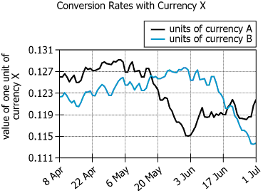
Graph showing currency X value history in units of currency A and currency B over 12 weeks

The graph shows the history of the value of currency X—in units of currency A and in units of currency B—for the 12-week period beginning on 8 April.


Based on the information provided, select from each drop-down menu the option that creates the most accurate statement.

For the 12-week period shown in the graph, the greatest value of a unit of currency X expressed in units of currency A occurred around, and the greatest value of a unit of currency X expressed in units of currency B occurred around.
Solution

Owning the Dataset

Table 1: Text Analysis

Text Component Content
Subject The value of currency X over time
Reference Currencies Measured in units of currency A and currency B
Time Span 12-week period, beginning on 8 April
Data Description Historical exchange rates of X to A and X to B

Table 2: Chart Analysis

Chart Feature Description
Chart Type Two-line chart (one for \(\mathrm{X/A}\), one for \(\mathrm{X/B}\))
X-Axis Dates: 12 weeks starting 8 April
Y-Axis Value of currency X (from \(\mathrm{0.111}\) to \(\mathrm{0.131}\))
Series 1 (black) Value of X in terms of currency A
Series 2 (blue) Value of X in terms of currency B
Peak Points Each line reaches its own maximum at different weeks
Crossing Point Lines cross around early June, indicating changing relative value

Key Insights

  • Currency X's value, as measured in currencies A and B, peaked at different times during the 12-week period
  • The chart suggests significant fluctuations, a crossover in early June, and separate local maxima for each line
  • This confirms that the highest values for currency X in each currency occurred in different weeks
  • The range of values (\(\mathrm{0.111}\) to \(\mathrm{0.131}\)) indicates substantial volatility in this timeframe

Step-by-Step Solution

Question 1: Finding the Greatest Value of Currency X in Terms of Currency A

Complete Statement:

For the 12-week period shown in the graph, the greatest value of a unit of currency X expressed in units of currency A occurred around ______.

Breaking Down the Statement
  • Statement Breakdown 1:
    • Key Phrase: greatest value of a unit of currency X
    • Meaning: We are being asked to find the maximum point for currency X's value.
    • Relation to Chart: This will be the highest y-value on the corresponding line on the chart.
    • Important Implications: We must identify which line represents currency A and then locate its maximum.
  • Statement Breakdown 2:
    • Key Phrase: expressed in units of currency A
    • Meaning: We must look at the value of X in terms of A.
    • Relation to Chart: The chart legend indicates the black solid line depicts \(\mathrm{X/A}\).
    • Important Implications: Only the black line should be considered for this blank.

What is needed: The date when the black line (\(\mathrm{X/A}\)) reaches its highest point.

Solution:
  • Condensed Solution Implementation:
    Visually inspect the chart for the highest point of the black line.
  • Necessary Data points:
    The graph shows that the black and blue lines cross in early June, and the black line peaks before this crossover.
  • Calculations Estimations:
    Of the options (04 May, 01 June, 30 June), the black line reaches its highest point before 01 June, which would be around 04 May.
  • Comparison to Answer Choices:
    04 May is the answer that fits the timing of the black line's peak before the crossover.
FINAL ANSWER Blank 1: 04 May

Question 2: Finding the Greatest Value of Currency X in Terms of Currency B

Complete Statement:

...and the greatest value of a unit of currency X expressed in units of currency B occurred around ______.

Breaking Down the Statement
  • Statement Breakdown 1:
    • Key Phrase: greatest value of a unit of currency X expressed in units of currency B
    • Meaning: We are being asked for the maximum value on the B line.
    • Relation to Chart: The chart legend says the blue (or cyan) line is \(\mathrm{X/B}\).

What is needed: The date when the blue (cyan) line (\(\mathrm{X/B}\)) reaches its highest point.

Solution:
  • Condensed Solution Implementation:
    Visually inspect the chart for the highest point of the blue line.
  • Necessary Data points:
    The blue line crosses the black line in early June and continues upward to its maximum after the crossover.
  • Calculations Estimations:
    Of the choices (04 May, 01 June, 30 June), the blue line appears to peak around or just after the early June crossover, so 01 June fits best.
  • Comparison to Answer Choices:
    01 June aligns with the timing of the blue line's maximum, based on the chart.
FINAL ANSWER Blank 2: 01 June

Summary

By matching each colored line to its currency and analyzing their peaks in relation to the crossover in early June, we find the greatest value for X in A occurs around 04 May and for X in B around 01 June.

Question Independence Analysis

Each blank refers to the value of currency X in a different reference currency; the answers are found independently by analyzing separate lines on the chart.

Answer Choices Explained
For the 12-week period shown in the graph, the greatest value of a unit of currency X expressed in units of currency A occurred around
1A
04 May
1B
01 June
1C
30 June
, and the greatest value of a unit of currency X expressed in units of currency B occurred around
2A
04 May
2B
01 June
2C
30 June
.
Rate this Solution
Tell us what you think about this solution
...
...
Forum Discussions
Start a new discussion
Post
Load More
Similar Questions
Finding similar questions...
Previous Attempts
Loading attempts...
Similar Questions
Finding similar questions...
Parallel Question Generator
Create AI-generated questions with similar patterns to master this question type.