Owning The Dataset
Table 1: Text Analysis
| Text Component |
Literal Content |
Simple Interpretation |
| Subject Matter |
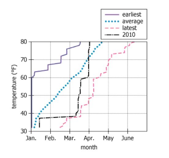
dates for when the temperature (\(°\mathrm{F}\)) first reached given levels |
The graph tracks the first day specific temperatures were reached in a year |
| Time Series Types |
earliest, latest, average, and 2010 |
Shows the first occurrence dates in the earliest year, latest year, average year, and 2010 specifically |
| Geographic Context |
one North American city |
The dataset covers a single (unspecified) city in North America |
| Time Period |
since 1893 |
The data spans from 1893 up to at least 2010 |
| Units |
temperature (\(°\mathrm{F}\)) |
All temperatures are measured in degrees Fahrenheit |
Table 2: Chart Analysis
| Chart Component |
What's Shown |
What This Tells Us |
| Chart Type |
Line graph with four time series |
Compares dates for temperature milestones across years and categories |
| X-axis |
Months: Jan–June |
Plots when in the year temperatures are first recorded |
| Y-axis |
Temperature: \(30°\mathrm{F}\) to \(80°\mathrm{F}\) |
Displays a range of first-hit temperature thresholds |
| Earliest Line (purple solid) |
\(70°\mathrm{F}\) reached ~Feb 15 |
In the earliest year, \(70°\mathrm{F}\) arrived very early (mid-February) |
| Average Line (blue dotted) |
\(70°\mathrm{F}\) reached ~April 1 |
Most years reach \(70°\mathrm{F}\) by about April 1 |
| 2010 Line (black dash-dot) |
\(70°\mathrm{F}\) reached ~March 15 |
In 2010, \(70°\mathrm{F}\) came midway between the earliest and average—early March |
| Latest Line (pink dashed) |
\(70°\mathrm{F}\) reached ~May 15 |
Some years saw \(70°\mathrm{F}\) as late as mid-May |
Key Insights
The chart reveals large variability in timing for the first \(70°\mathrm{F}\) day, ranging from as early as mid-February to as late as mid-May—a three-month spread. On average, the first \(70°\mathrm{F}\) occurs around April 1, while in 2010 it came about two weeks earlier (March 15). The data shows substantial year-to-year swings in seasonal warming, with some years very early and some quite late, but all temperature levels are reached progressively later in the year as the threshold rises.
Step-by-Step Solution
Question 1: Earliest Date to Reach \(70°\mathrm{F}\)
Complete Statement:
From 1893 to 2010, the earliest date that the temperature first reached 70° in any year was approximately [BLANK 1].
Breaking Down the Statement
- Statement Breakdown 1:
- Key Phrase: From 1893 to 2010
Meaning: Specifies the time frame under consideration: all years from 1893 through 2010.
Relation to Chart: The graph shows data across the entire timespan, including earliest, latest, and average dates for reaching \(70°\mathrm{F}\).
Important Implications: We are searching for the single earliest recorded date to reach \(70°\mathrm{F}\) in this timeframe.
- Statement Breakdown 2:
- Key Phrase: the earliest date that the temperature first reached 70° in any year
Meaning: Identify the absolute earliest date when \(70°\mathrm{F}\) was first recorded in a year, over all the years shown.
Relation to Chart: Corresponds to the point where the 'earliest' line (solid purple) meets the \(70°\mathrm{F}\) level.
Important Implications: This is an extreme value; does not represent an average or a typical value but a single data outlier.
- What is needed: The single earliest date on which the temperature rose to \(70°\mathrm{F}\), as indicated by the intersection of the 'earliest' line with the \(70°\mathrm{F}\) temperature marker.
Solution:
- Condensed Solution Implementation:
Visually check the graph for where the solid purple 'earliest' line intersects the \(70°\mathrm{F}\) horizontal gridline.
- Necessary Data points:
The x-axis (date) value at which the 'earliest' line crosses the \(70°\mathrm{F}\) mark corresponds to the answer.
- Calculations Estimations:
The intersection occurs midway through February.
- Comparison to Answer Choices:
Among the given choices (February 1, February 15, March 1, March 15), February 15 best matches that intersection.
FINAL ANSWER Blank 1: February 15
Question 2: 2010 Date Compared to Average
Complete Statement:
In 2010, the date that the temperature first reached 70° was [BLANK 2] date.
Breaking Down the Statement
- Statement Breakdown 1:
- Key Phrase: In 2010, the date that the temperature first reached 70°
Meaning: Find the 2010-specific date where \(70°\mathrm{F}\) was first reached.
Relation to Chart: This is shown by the black dash-dot '2010' line intersecting the \(70°\mathrm{F}\) level.
- Statement Breakdown 2:
- Key Phrase: [BLANK 2] date
Meaning: Requires comparison between the 2010 date and the average date for first reaching \(70°\mathrm{F}\).
Relation to Chart: Compare intersection points of the '2010' line and the dotted blue 'average' line with the \(70°\mathrm{F}\) marker.
- What is needed: Whether the date for reaching \(70°\mathrm{F}\) in 2010 was well before, approximately the same, or well after the average date.
Solution:
- Condensed Solution Implementation:
Compare where the black dash-dot '2010' line and the blue dotted 'average' line each cross the \(70°\mathrm{F}\) horizontal line.
- Necessary Data points:
The intersection points for the '2010' and 'average' lines with \(70°\mathrm{F}\) are at almost the same time (mid-March).
- Calculations Estimations:
Both lines cross at nearly the same point (mid-March) on the x-axis, suggesting little or no difference.
- Comparison to Answer Choices:
Since both lines intersect the \(70°\mathrm{F}\) mark at similar dates, 'approximately the average' is the best fit among the answer choices.
FINAL ANSWER Blank 2: approximately the average
Summary
By visually examining where the respective lines for 'earliest' and '2010' intersect \(70°\mathrm{F}\) on the chart, and comparing those to answer choices, it is clear that the earliest-ever occurrence was on February 15 and that 2010's event was approximately at the historical average date.
Question Independence Analysis
These questions are independent, as one relies on a historical extreme across all years, and the other compares a specific year's occurrence to the multi-year average. Solving one does not affect answering the other.
