Loading...

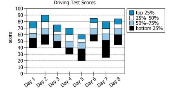
The graph shows the distributions of scores on official driving tests administered within a certain municipality for eight consecutive business days.
Select from each drop-down menu the option that creates the most accurate statement, given the information provided.
| Text Component | Content |
|---|---|
| Subject | Distributions of scores on official driving tests |
| Location | Administered within a certain municipality |
| Time Frame | Eight consecutive business days |
| Focus | Score distributions, not just averages |
| Chart Component | Description |
|---|---|
| Chart Type | Stacked bar chart showing 8 days (Day 1-8); each bar divided into 4 quartiles |
| Y-Axis | Test scores from 0 to 100 |
| X-Axis | Days 1 through 8 |
| Quartile Segments | Each segment shows the score range for a quartile (bottom 25%, \\(\mathrm{25-50\%}\\), \\(\mathrm{50-75\%}\\), top 25%) per day |
| Range and Minimum/Maximum | Lowest minimum: Day 5 (score 20); highest maximum: Day 2 (score 90); overall range is 70 points |
The chart displays how test scores are distributed across eight sequential days, dividing each day's results into quartiles. The median score for each day sits at the boundary between the \\(\mathrm{25-50\%}\\) and \\(\mathrm{50-75\%}\\) segments. The overall range across all days is 70 points (from \\(\mathrm{20 \text{ to } 90}\\)), with this range fully captured by combining Day 2 and Day 5. While median and range are visually discernible, mean values for each day or group of days cannot be precisely determined from the chart alone.
The graph provides enough information to determine that the [mean score/median score/range of scores] over all of the days indicated in the graph is the same as that for [Day 1 and Day 8/Day 2 and Day 5/Day 3 and Day 7/Day 4 and Day 5] combined.
What is needed: Which statistic—mean, median, or range—can be both determined from quartile data and matches for all days and for some specific pair of days' combined scores.
The graph provides enough information to determine that the range of scores over all of the days indicated in the graph is the same as that for [Day 1 and Day 8/Day 2 and Day 5/Day 3 and Day 7/Day 4 and Day 5] combined.
What is needed: Which day pair contains both the lowest minimum (20) and the highest maximum (90), to achieve a 70-point range.
By reviewing how quartile data is presented in the chart, it becomes clear that the range of scores (maximum minus minimum) is the only statistic that can be directly calculated for all days and for a specific pair of days. Only Day 2 (max = 90) and Day 5 (min = 20) together match the overall range across all eight days.
The questions are dependent. The correct completion of the second blank depends on what statistic is chosen in the first blank. Once 'range of scores' is selected for the first blank, only one pair of days—Day 2 and Day 5—has the required minimum and maximum values for the second blank.