e-GMAT Logo
NEUR
N

The graph shows the distribution of funding sources for medical expenses incurred at a certain hospital in Country C for...

GMAT Graphics Interpretation : (GI) Questions

Source: Official Guide
Graphics Interpretation
GI - Stats
MEDIUM
...
...
Notes
Post a Query
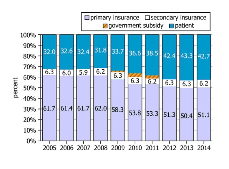
Graph showing distribution of funding sources for medical expenses

The graph shows the distribution of funding sources for medical expenses incurred at a certain hospital in Country C for the years 2005-2014. For example, in 2005, 61.7% of medical expenses incurred at this hospital were paid by the patient's primary insurance, 6.3% by the patient's secondary insurance, and 32.0% by the patient. In the years 2009, 2010, and 2011, the government of Country C provided a subsidy that paid a small percent of the medical expenses.

The ratio of the percent paid by the patient to the percent paid by the patient's primary insurance was greatest in the yearand least in the year.
Solution

Owning the Dataset

Table 1: Text Analysis

Text Component Content/Meaning
Context Distribution of funding sources for medical expenses at a hospital in Country C (2005-2014)
Payment sources identified Primary insurance, secondary insurance, patient, (and government subsidy in 2009-2011)
Example breakdown (2005) \(61.7\%\) primary insurance, \(6.3\%\) secondary insurance, \(32.0\%\) patient
Special case Government subsidized a small percent in 2009, 2010, 2011
Data type Percent paid per source per year, all sum to 100%

Table 2: Chart Analysis

Chart Aspect Description
Chart type 100% stacked bar chart (years 2005-2014 on X-axis, percent of expense on Y-axis)
Categories shown Primary insurance, secondary insurance, patient, government subsidy
Trend primary ins. Decreases from \(61.7\%\) (2005) to \(50.4\%\) (2013)
Trend patient Increases from \(32.0\%\) (2005) to \(43.3\%\) (2013)
Trend secondary ins. Remains stable around 6-6.3% throughout
Gov't subsidy Present only in 2009, 2010, 2011 (small percent)

Key Insights

Over the ten-year period, the portion of medical expenses paid by patients rose steadily, while coverage from primary insurance declined. Secondary insurance remained a small, constant contributor. The government only briefly subsidized expenses (2009-2011), indicating a short-term intervention. By 2013, patients bore a much higher share of costs than in 2005.

Step-by-Step Solution

Question 1: Finding the Year with the Greatest Patient-to-Primary Insurance Ratio

Complete Statement:

The ratio of the percent paid by the patient to the percent paid by the patient's primary insurance was greatest in the year [BLANK 1]

Breaking Down the Statement
  • Statement Breakdown 1:
    • Key Phrase: ratio of the percent paid by the patient to the percent paid by the patient's primary insurance
      • Meaning: Calculate the value by dividing the patient payment percentage by the primary insurance payment percentage for each year.
      • Relation to Chart: Use the percentages for patient payments and primary insurance payments shown for each year in the chart.
      • Important Implications: A larger ratio means patients are paying more relative to what insurance is covering. We're looking for the largest such value among the given years.
  • Statement Breakdown 2:
    • Key Phrase: was greatest
      • Meaning: We seek the highest value of this ratio over the specified years.
      • Relation to Chart: Look for the year where patient percentage is relatively high and primary insurance percentage is relatively low.
      • Important Implications: This is likely to happen in later years if the patient percentage rises and insurance percentage falls.
  • What is needed: Determine in which year, among the provided choices (2005, 2007, 2009, 2011, 2013), the ratio: \(\frac{\text{patient }\%}{\text{primary insurance }\%}\) is the greatest.
Solution:
  • Condensed Solution Implementation:
    Estimate or calculate the ratio for each of the years in the answer choices and compare the results.
  • Necessary Data points:
    Patient and primary insurance payment percentages for 2005, 2007, 2009, 2011, and 2013: 2005 (\(32.0\%, 61.7\%\)), 2007 (\(32.4\%, 61.7\%\)), 2009 (\(33.7\%, 58.3\%\)), 2011 (\(38.5\%, 53.3\%\)), 2013 (\(43.3\%, 50.4\%\)).
    • Calculations Estimations:
      Ratios: 2005: \(32.0/61.7 \approx 0.52\); 2007: \(32.4/61.7 \approx 0.52\); 2009: \(33.7/58.3 \approx 0.58\); 2011: \(38.5/53.3 \approx 0.72\); 2013: \(43.3/50.4 \approx 0.86\).
    • Comparison to Answer Choices:
      2013 has the largest ratio (\(\approx 0.86\)), higher than all the other listed years. Therefore, 2013 is the answer.
FINAL ANSWER Blank 1: 2013

Question 2: Finding the Year with the Least Patient-to-Primary Insurance Ratio

Complete Statement:

The ratio of the percent paid by the patient to the percent paid by the patient's primary insurance was least in the year [BLANK 2]

Breaking Down the Statement
  • Statement Breakdown 1:
    • Key Phrase: ratio of the percent paid by the patient to the percent paid by the patient's primary insurance
      • Meaning: Calculate the value by dividing the patient payment percentage by the primary insurance payment percentage for each year.
      • Relation to Chart: Use the patient and primary insurance percentages from the chart for each year.
  • Statement Breakdown 2:
    • Key Phrase: was least
      • Meaning: We seek the smallest value (lowest ratio) over the specified years.
      • Relation to Chart: Look for the year where patient percentage is relatively low and primary insurance percentage is relatively high.
  • What is needed: Determine in which year, among the provided choices (2006, 2008, 2010, 2012, 2014), the ratio: \(\frac{\text{patient }\%}{\text{primary insurance }\%}\) is the smallest.
Solution:
  • Condensed Solution Implementation:
    Estimate or calculate the ratio for each of the years in the answer choices and compare the results.
  • Necessary Data points:
    Patient and primary insurance payment percentages for 2006, 2008, 2010, 2012, and 2014: 2006 (\(32.6\%, 61.4\%\)), 2008 (\(31.8\%, 62.0\%\)), 2010 (\(36.6\%, 53.8\%\)), 2012 (\(42.4\%, 51.3\%\)), 2014 (\(42.7\%, 51.1\%\)).
    • Calculations Estimations:
      Ratios: 2006: \(32.6/61.4 \approx 0.53\); 2008: \(31.8/62.0 \approx 0.51\); 2010: \(36.6/53.8 \approx 0.68\); 2012: \(42.4/51.3 \approx 0.83\); 2014: \(42.7/51.1 \approx 0.84\).
    • Comparison to Answer Choices:
      2008 has the smallest ratio (\(\approx 0.51\)), lower than all the other listed years. Therefore, 2008 is the answer.
FINAL ANSWER Blank 2: 2008

Summary

Over the years, the share of medical expenses paid by patients increased while the share paid by primary insurance decreased. Thus, the patient-to-primary insurance ratio was the greatest in 2013 (about \(0.86\)) and the least in 2008 (about \(0.51\)).

Question Independence Analysis

These blanks are independent: Blank 1 asks for the year with the highest patient-to-insurance ratio from one group of years, while Blank 2 asks for the lowest from a separate group. Finding one does not determine the other.

Answer Choices Explained
The ratio of the percent paid by the patient to the percent paid by the patient's primary insurance was greatest in the year
1A
2005
1B
2007
1C
2009
1D
2011
1E
2013
and least in the year
2A
2006
2B
2008
2C
2010
2D
2012
2E
2014
.
Rate this Solution
Tell us what you think about this solution
...
...
Forum Discussions
Start a new discussion
Post
Load More
Similar Questions
Finding similar questions...
Previous Attempts
Loading attempts...
Similar Questions
Finding similar questions...
Parallel Question Generator
Create AI-generated questions with similar patterns to master this question type.