e-GMAT Logo
NEUR
N

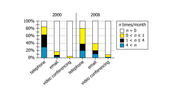
The graph shows data for physicians who, in 2000 and 2008, were surveyed about the average number of times per...

GMAT Graphics Interpretation : (GI) Questions

Source: Official Guide
Graphics Interpretation
GI - Stats
HARD
...
...
Notes
Post a Query
Graph showing physician communication method usage data

The graph shows data for physicians who, in 2000 and 2008, were surveyed about the average number of times per month they used each of 3 methods (telephone, email, and video conferencing) to communicate with their patients. The bars represent the percentage of the respondents who reported using the indicated method the indicated number of times per month.


Select from each drop-down menu the option that completes the statement so that it most accurately reflects the information provided.

It must be the case that the median number of times per month respondents reported having communicated with patients byin the 2008 survey was less than that in the 2000 survey.
It must be the case that the percentage of respondents who reported having communicated with patients by bothwas as great or greater in the 2008 survey as it was in the 2000 survey.
Solution

Owning The Dataset

Table 1: Text Analysis

Text Component Literal Content Simple Interpretation
Survey subjects Physicians in 2000 and 2008 Doctors surveyed in two years
Methods surveyed Telephone, email, and video conferencing Three ways doctors communicate with patients
Measurement Average number of times per month for each method How often each communication method was used monthly
Data presented as Bars represent % of respondents for each method & frequency range For each method/frequency, percent of doctors who use it that much
Frequency categories \(\mathrm{n=0}\); \(\mathrm{0\lt n≤1}\); \(\mathrm{1\lt n≤4}\); \(\mathrm{4\lt n}\) Four bins: never, rare, moderate, frequent communications
Purpose Communicate with patients All communication methods are for doctor-patient contact

Table 2: Chart Analysis

Chart Component What's Shown What This Indicates
Layout Side-by-side bars for 2000 and 2008, for each method Allows direct year-to-year comparison for each method
Frequency distribution Stacked colored bar segments (four frequency bins per method per year) Reveals spread of doctor usage—most never or rarely used email or video
Telephone (2000 vs 2008) Frequent (\(\mathrm{4\lt n}\)) users decreased (\(\mathrm{25\%→20\%}\)); rare users (\(\mathrm{0\lt n≤1}\)) increased (\(\mathrm{10\%→31\%}\)) More doctors used phone infrequently in 2008; fewer used it very often
Email (2000 vs 2008) Non-users decreased (\(\mathrm{72\%→60\%}\)); moderate/frequent users increased (\(\mathrm{1≤n≤4: 18\%→25\%; 4\lt n: 2\%→10\%}\)) Email use became more common, but most still didn't use it monthly
Video conferencing (2000/08) Non-users: \(\mathrm{96\%→90\%}\); minor rise in any use (all below \(\mathrm{1\lt n≤4}\) or \(\mathrm{4\lt n}\) in both years) Video use remained rare, but more doctors tried it by 2008

Key Insights

  1. By 2008, the median number of telephone contacts per doctor dropped to the \(\mathrm{0\lt n≤1}\) per month category, showing a notable decline in typical phone use versus 2000.
  2. Email use increased substantially: both the proportion of email users and those who used it frequently (4+ times/month) rose, though most still reported not using email at all.
  3. Video conferencing remained infrequent—only about 10% of doctors in 2008 used it at all, typically less than once a month, demonstrating slow adoption compared to email.

Step-by-Step Solution

Question 1: Median Communication Frequency Comparison

Complete Statement:

It must be the case that the median number of times per month respondents reported having communicated with patients by [BLANK 1] in the 2008 survey was less than that in the 2000 survey.

Breaking Down the Statement
  • Statement Breakdown 1:
    • Key Phrase: median number of times per month
      • Meaning: The middle value of respondents' reported communication frequencies for each method.
      • Relation to Chart: The median falls where the cumulative percentage of respondents reaches or exceeds 50% in the stacked bar.
      • Important Implications: To determine the median, we need to find the frequency interval that brings the cumulative total over 50% for each method in each year.
  • Statement Breakdown 2:
    • Key Phrase: less than that in the 2000 survey
      • Meaning: We are looking for a communication method where the median usage category in 2008 is lower than in 2000.
      • Relation to Chart: Compare for each method the frequency interval containing the 50th percentile for both years.
      • Important Implications: A lower position of the median in 2008 than 2000 means less frequent communication by that method in 2008.
  • What is needed: We need to find which communication method saw its median respondent usage frequency decrease from 2000 to 2008.
Solution:
  • Condensed Solution Implementation:
    For each method, sum the stacked bar percentages from lowest to highest frequency intervals for both years, and see which methods had their median fall into a lower frequency interval in 2008 compared to 2000.
  • Necessary Data points:
    Proportions of respondents in each usage category for telephone, email, and video conferencing in both years.
    • Calculations Estimations:
      Telephone (2000): 17% (\(\mathrm{n=0}\)) + 21% (\(\mathrm{0\lt n≤1}\)) = 38%; next bin (\(\mathrm{1\lt n≤4}\)) reaches 75%. Thus, the 50th percentile is in '\(\mathrm{1\lt n≤4}\)'. Telephone (2008): 20% (\(\mathrm{n=0}\)) + 42% (\(\mathrm{0\lt n≤1}\)) = 62%. So the median is in '\(\mathrm{0\lt n≤1}\)'. Email and video: in both years, >50% of respondents are in \(\mathrm{n=0}\), so the median does not change from 2000 to 2008 (always at 0).
    • Comparison to Answer Choices:
      Only telephone had its median move to a lower frequency category in 2008 than in 2000.
FINAL ANSWER Blank 1: telephone

Question 2: Joint Usage Percentage Analysis

Complete Statement:

It must be the case that the percentage of respondents who reported having communicated with patients by both [BLANK 2] was as great or greater in the 2008 survey as it was in the 2000 survey.

Breaking Down the Statement
  • Statement Breakdown 1:
    • Key Phrase: percentage of respondents who reported having communicated...by both
      • Meaning: We want the percentage of respondents who used both methods in a given pair.
      • Relation to Chart: Exact overlaps are not shown, so we must use set theory bounds based on total individual user percentages for each method.
  • Statement Breakdown 2:
    • Key Phrase: as great or greater in the 2008 survey as it was in the 2000 survey
      • Meaning: We are seeking a pair for which the lowest possible overlap percentage in 2008 is at least as high as the highest possible overlap percentage in 2000.
      • Relation to Chart: Apply inclusion-exclusion principle to calculate bounds.
  • What is needed: Which pair of communication methods (telephone/email, telephone/video, or email/video) could have had their minimum possible joint user percentage in 2008 at least as large as their maximum possible joint user percentage in 2000.
Solution:
  • Condensed Solution Implementation:
    For each possible pair, calculate the minimum possible overlap in 2008 (max(0, sum of their individual percentages in 2008 minus 100%)) and maximum possible overlap in 2000 (the smaller of the two individual usage percentages in 2000).
  • Necessary Data points:
    Percentage used (>0 times): Telephone—2000: 83%, 2008: 80%. Email—2000: 18%, 2008: 40%. Video—2000: 4%, 2008: 10%.
    • Calculations Estimations:
      Telephone and email: 2000 max overlap: min(83%,18%)=18%. 2008 min overlap: 80%+40%-100%=20%. So, 20% ≥ 18%. Telephone and video: 2000 max: min(83%,4%)=4%. 2008 min: 80%+10%-100%=0%. So, 0%<4%. Email and video: 2000 max: 4%. 2008 min: 40%+10%-100%=0%. Again, 0%<4%.
    • Comparison to Answer Choices:
      Only telephone and email satisfy the criterion that the minimum 2008 joint usage could be as great as or greater than the maximum joint usage in 2000.
FINAL ANSWER Blank 2: telephone and email

Summary

For Blank 1, only telephone showed a decrease in median frequency category between 2000 and 2008. For Blank 2, only the combination of telephone and email meets the requirement that their minimum joint user percentage in 2008 was at least as great as the maximum in 2000.

Question Independence Analysis

The two blanks are independent. Blank 1 asks about the change in median usage for an individual communication method, while Blank 2 focuses on the joint use of pairs of methods. Their solutions do not rely on one another.

Answer Choices Explained
It must be the case that the median number of times per month respondents reported having communicated with patients by
1A
telephone
1B
email
1C
video conferencing
in the 2008 survey was less than that in the 2000 survey.
It must be the case that the percentage of respondents who reported having communicated with patients by both
2A
telephone and email
2B
telephone and video conferencing
2C
email and video conferencing
was as great or greater in the 2008 survey as it was in the 2000 survey.
Rate this Solution
Tell us what you think about this solution
...
...
Forum Discussions
Start a new discussion
Post
Load More
Similar Questions
Finding similar questions...
Previous Attempts
Loading attempts...
Similar Questions
Finding similar questions...
Parallel Question Generator
Create AI-generated questions with similar patterns to master this question type.