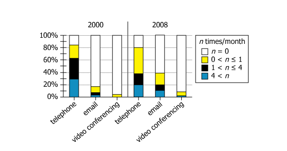
The graph shows data for physicians who, in 2000 and 2008, were surveyed about the average number of times per...
GMAT Graphics Interpretation : (GI) Questions

The graph shows data for physicians who, in 2000 and 2008, were surveyed about the average number of times per month they used each of 3 methods (telephone, email, and video conferencing) to communicate with their patients. The bars represent the percentage of the respondents who reported using the indicated method the indicated number of times per month.
Select from each drop-down menu the option that completes the statement so that it most accurately reflects the information provided.
Owning the Dataset
Table 1: Text Analysis
Text Component | Literal Content | Interpretation |
---|---|---|
Subject | Physicians who were surveyed in 2000 and 2008 | Doctors giving information about their patient communication |
Time Periods | 2000 and 2008 | Data from two points in time, allowing for trend comparison |
Measured Variable | Average number of times per month using each of 3 methods (telephone, email, video conferencing) | How often different communication technologies are used |
Communication Methods | Telephone, Email, Video Conferencing | Three specific methods examined |
Data Representation | The bars represent percentage of respondents reporting each frequency | Bars show proportion of doctors in each usage-frequency category |
Table 2: Chart Analysis
Chart Component | What is Displayed | What it Shows |
---|---|---|
Chart Type | Stacked bar chart, 3 methods × 2 years | Allows comparison across time and between methods |
Frequency Categories | \(\mathrm{n=0}\), \(\mathrm{0\lt n≤1}\), \(\mathrm{1\lt n≤4}\), \(\mathrm{4\lt n}\) (per month) | Ranges classify intensity of use for each communication method |
Y-axis | Percentage of physicians (0–100%) | Proportion of doctors in each category adds up to 100% |
Color Coding | White (none), Yellow (rarely), Black (sometimes), Blue (often) | Color visually distinguishes usage categories |
Telephone (2000→2008) | More "rarely", less "sometimes/never" | Median usage category dropped, trend toward less usage |
Email (2000→2008) | More usage at all frequencies, fewer non-users | Email became much more widely used, especially heavy use |
Video Conferencing | Remained >90% non-users both years | Technology adoption extremely limited throughout |
Key Insights
- Median monthly telephone use among doctors declined: in 2000 over half used telephones more than once per month, but by 2008 this dropped below once per month.
- Email saw strong adoption: heavy (4+ times/month) usage climbed fivefold from 2% to 10%, and non-users fell from 72% to 60%.
- Video conferencing stayed extremely rare: over 90% of physicians never used it, both years.
- The minimum proportion of doctors using more than one method rose as nonusers of email and video both decreased, indicating overall greater communication overlap and diversification.
Step-by-Step Solution
Question 1: Median Communication Frequency Decline
Complete Statement:
It must be the case that the median number of times per month respondents reported having communicated with patients by [BLANK 1] in the 2008 survey was less than that in the 2000 survey.
Breaking Down the Statement
- Statement Breakdown 1:
- Key Phrase: median number of times per month
- Meaning: The value that splits all respondents into two equal groups based on how often they use a communication method.
- Relation to Chart: Look for where the cumulative percentage of respondents using a method first exceeds 50% in each year.
- Important Implications: Changes in the position of the median indicate changes in communication frequency for a given method.
- Key Phrase: median number of times per month
- Statement Breakdown 2:
- Key Phrase: was less than that in the 2000 survey
- Meaning: The typical (middle) respondent used the method less frequently in 2008 than in 2000.
- Relation to Chart: The category containing the median shifted lower on the frequency scale from 2000 to 2008.
- Important Implications: We should find a method with a clear median drop between the two years.
- Key Phrase: was less than that in the 2000 survey
- What is needed: Which communication method had its median usage shift to a lower frequency category in 2008 compared to 2000.
Solution:
- Condensed Solution Implementation:
Find the category that contains the 50th percentile (median) for each method in each year, by adding percentages from lowest upward to exceed 50%. - Necessary Data points:
Telephone: In 2000, 17% (\(\mathrm{n=0}\)) + 21% (\(\mathrm{0\lt n≤1}\)) = 38%, so median is in the \(\mathrm{1\lt n≤4}\) category (since 38% < 50%). In 2008, 20% (\(\mathrm{n=0}\)) + 42% (\(\mathrm{0\lt n≤1}\)) = 62%, so median is in \(\mathrm{0\lt n≤1}\).- Calculations Estimations:
For telephone: median frequency moved from \(\mathrm{1\lt n≤4}\) (2000) down to \(\mathrm{0\lt n≤1}\) (2008). For email and video conferencing, both have medians at 0 in both years (majority never use). - Comparison to Answer Choices:
Only telephone's median usage shifted down; email and video remained at 0.
- Calculations Estimations:
FINAL ANSWER Blank 1: telephone
Question 2: Communication Method Overlap Percentage
Complete Statement:
It must be the case that the percentage of respondents who reported having communicated with patients by both [BLANK 2] was as great or greater in the 2008 survey as it was in the 2000 survey.
Breaking Down the Statement
- Statement Breakdown 1:
- Key Phrase: communicated with patients by both
- Meaning: Respondents who used both methods, not just one or the other.
- Relation to Chart: Can be inferred by calculating minimum possible overlap from the percentages for each method.
- Key Phrase: communicated with patients by both
- Statement Breakdown 2:
- Key Phrase: was as great or greater in the 2008 survey
- Meaning: The combined-usage percentage stayed the same or increased from 2000 to 2008.
- Relation to Chart: Calculate minimum possible overlap for each year to compare.
- Key Phrase: was as great or greater in the 2008 survey
- What is needed: Which pair of communication methods showed at least as much, or more, overlap (joint use) among respondents in 2008 as in 2000.
Solution:
- Condensed Solution Implementation:
Calculate the minimum possible overlap as (percent using A) + (percent using B) - 100%, or 0% if the sum is 100% or less. - Necessary Data points:
Telephone: 83% (2000), 80% (2008); Email: 28% (2000), 40% (2008); Video: 4% (2000), 10% (2008).- Calculations Estimations:
Telephone & Email: 2000: 83% + 28% = 111%, overlap minimum 11%. 2008: 80% + 40% = 120%, overlap minimum 20%. Telephone & Video: 2000: 83% + 4% = 87%, overlap = 0%. 2008: 80% + 10% = 90%, overlap = 0%. Email & Video: 2000: 28% + 4% = 32%, overlap = 0%. 2008: 40% + 10% = 50%, overlap = 0%. - Comparison to Answer Choices:
Only telephone and email show an increase in minimum overlap from 11% to 20%.
- Calculations Estimations:
FINAL ANSWER Blank 2: telephone and email
Summary
To answer these questions, we used the cumulative percentage approach to find shifts in median frequency for each communication method and applied the inclusion-exclusion principle to estimate the smallest possible overlap in combined usage. Only telephone had a drop in median usage, while only the telephone and email pair showed a clear increase in minimum overlap.
Question Independence Analysis
The two blanks address unrelated aspects: the first asks about median frequency shifts for single communication methods, while the second asks about overlap between pairs. Each can be solved without reference to the other.