Loading...

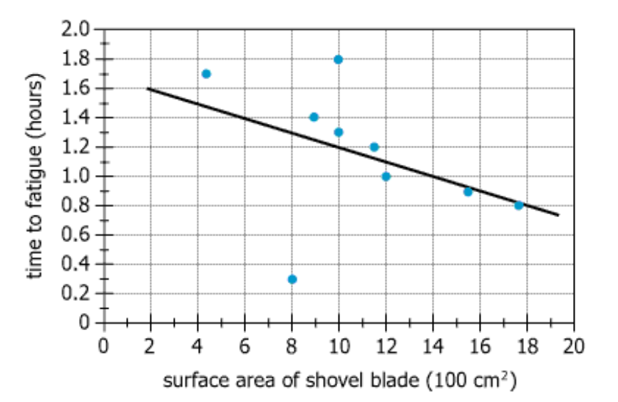
The graph displays experimental data relating the surface area of a snow shovel's blade, in hundreds of square centimeters (\(100 \text{ cm}^2\)), to the time to fatigue: the minimum number of hours of snow shoveling until a healthy adult feels too fatigued to continue. The line shown is a trendline corresponding to the data. From each drop-down menu, select the option that creates the most accurate statement based on the information provided.
Text Analysis Table
| Component | Literal Content | Interpretation |
|---|---|---|
| Subject Matter | Experimental data relating the surface area of a snow shovel's blade to the time to fatigue | Study measures effect of shovel size on time adults can shovel before exhaustion |
| X-axis Variable | Surface area of a snow shovel's blade, in hundreds of square centimeters (\(100\text{ cm}^2\)) | Shovel blade size in units of \(100\text{ cm}^2\) |
| Y-axis Variable | Time to fatigue: the minimum number of hours of snow shoveling until a healthy adult feels too fatigued to continue | Number of hours someone can keep shoveling before being too tired |
| Trendline | The line shown is a trendline corresponding to the data | Visual indication of overall relationship between blade size and time to fatigue |
Chart Analysis Table
| Chart Feature | Details | Interpretation |
|---|---|---|
| Chart Type | Scatter plot with trendline | Shows individual data and the general trend |
| X-axis Scale | 0–20 (\(100\text{ cm}^2\) units); so range is 0 to \(2000\text{ cm}^2\) | Range of shovel sizes tested |
| Y-axis Scale | 0–2.0 hours | Maximum measured time to fatigue |
| Slope (Trendline) | Negative, approx. \(-0.05\text{ h per }100\text{ cm}^2\) | Increasing blade area decreases the time before exhaustion |
| Data Distribution | Most points near trendline; one outlier at \(x=8\) (\(800\text{ cm}^2\)), \(y≈0.3\text{ h}\) | Experimental results are mostly predictable except for the outlier |
| Notable Outlier | Point at (\(800\text{ cm}^2\), ~0.3h) | One participant fatigued earlier than others with that shovel size |
The data point for which the distance to the trendline is greatest corresponds to a shovel-blade surface area that is approximately _______ \(\text{cm}^2\).
Statement Breakdown 1:
Statement Breakdown 2:
What is needed: The x-axis value (in \(\text{cm}^2\)) of the point farthest from the trendline.
Condensed Solution Implementation:
Scan the scatter plot for the point farthest from the trendline. Identify its x-value.
Necessary Data points:
On the plot, the outlier is at \(x = 8\) (representing \(8 × 100 = 800\text{ cm}^2\)).
Calculations Estimations:
\(x = 8\) corresponds to \(800\text{ cm}^2\) (since each unit is \(100\text{ cm}^2\)).
Comparison to Answer Choices:
Possible answers: 400, 600, 800, 1000. 800 is correct.
According to the trendline, each 0.1-hour decrease in time to fatigue corresponds to an increase in shovel-blade surface area that is approximately _______ \(\text{cm}^2\).
Statement Breakdown 1:
Statement Breakdown 2:
What is needed: The increase in shovel-blade surface area (\(\text{cm}^2\)) that leads to a 0.1-hour decrease in time to fatigue according to the trendline.
Condensed Solution Implementation:
Calculate the x-axis change needed for a 0.1-hour decrease, using the trendline slope.
Necessary Data points:
Slope ≈ \(-0.05\text{ hours per }100\text{ cm}^2\) (every increase of \(100\text{ cm}^2\) reduces time by 0.05 hours).
Calculations Estimations:
0.1-hour decrease requires \(2 × 100\text{ cm}^2 = 200\text{ cm}^2\) increase (since 0.05 hours per \(100\text{ cm}^2\), and \(0.1\text{ hours} ÷ 0.05 = 2\)).
Comparison to Answer Choices:
Possible answers: 100, 150, 200, 250. 200 is correct.
Blank 1 is solved by visually identifying the biggest outlier on the scatterplot (\(800\text{ cm}^2\)). Blank 2 is solved by applying the trendline's slope to see that a 0.1-hour decrease in fatigue corresponds to a \(200\text{ cm}^2\) blade area increase.
The questions are independent: one requires identifying an outlier and the other is about interpreting the trendline's slope. Solving one does not require solving the other.