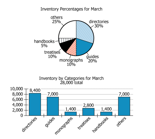
The circle graph and the bar graph were created by two different people. They represent the same inventory of 28,000...
GMAT Graphics Interpretation : (GI) Questions

The circle graph and the bar graph were created by two different people. They represent the same inventory of 28,000 items. However, the people creating the graphs classified some of the items differently (placing some of the items into different categories).
Select from each drop-down menu the option that creates the most accurate statement.
Owning the Dataset
Table 1: Text Analysis
Text Component | Literal Content | Simple Interpretation |
---|---|---|
Graph creators | created by two different people | Two people made these graphs separately. |
Inventory represented | represent the same inventory of 28,000 items | Both graphs display data about the same 28,000 items. |
Classification comment | classified some of the items differently (placing some of the items into different categories) | Some items are placed in different categories in each graph. |
Table 2: Chart Analysis
Chart Component | Observation | What This Means |
---|---|---|
Chart Types | Pie (circle) shows percentages; Bar shows actual counts | Two ways to display the same dataset |
Categories | Both graphs use: directories, guides, monographs, treatises, handbooks, others | Same labels, but contents may differ |
Guides Count | Pie: \(20\%\) (=5,600); Bar: 7,000 | 1,400 more items classified as guides in Bar chart |
Monographs Count | Pie: \(10\%\) (=2,800); Bar: 1,400 | 1,400 fewer items classified as monographs in Bar chart |
Other Categories | All others (directories, treatises, handbooks, others) match in number & percent | These categories were classified the same in both charts |
Key Insights
There is a direct, balanced shift of 1,400 items between the 'guides' and 'monographs' categories: the Bar chart places these items in 'guides' while the Pie chart places them in 'monographs'. All other category totals match exactly. This highlights how different interpretations or classification decisions by the chart creators led to a notable reallocation of items, even when using identical category names with the same overall dataset.
Step-by-Step Solution
Question 1: Identifying the Bar Graph Category with Classification Differences
Complete Statement:
It can be inferred from the information provided that the category of [BLANK 1] in the bar graph includes items that are not classified the same in the circle graph.
Breaking Down the Statement
- Statement Breakdown 1:
- Key Phrase: category of [BLANK 1] in the bar graph
Meaning: This refers to a specific category shown on the bar graph.
Relation to Chart: We look at the individual categories as labeled in the bar graph.
Important Implications: We're focused on how this bar graph category could include items counted differently in the circle (pie) graph.
- Key Phrase: category of [BLANK 1] in the bar graph
- Statement Breakdown 2:
- Key Phrase: includes items that are not classified the same in the circle graph
Meaning: Some items in this category may be classified differently in the pie chart.
Relation to Chart: This involves observing discrepancies between the bar chart's count and the pie chart's suggested count from its percentage.
Important Implications: If the bar's count for a category is greater than the pie's expected value, that surplus may represent items classified elsewhere in the pie chart.
- Key Phrase: includes items that are not classified the same in the circle graph
- What is needed: Which bar graph category contains extra items compared to its category in the pie chart.
Solution:
- Condensed Solution Implementation:
Convert pie chart percentages to expected counts, then compare with bar graph counts for each category to identify any surplus. - Necessary Data points:
Pie chart: guides = \(20\%\) (expected 5,600); Bar chart: guides = 7,000; Total items = 28,000. - Calculations Estimations:
Pie chart (guides): \(20\% \times 28{,}000 = 5{,}600\). Bar chart (guides): 7,000 items. Bar chart shows 1,400 more items for guides than pie chart. - Comparison to Answer Choices:
Only the 'guides' category in the bar chart has 1,400 more items than would be expected from the pie chart, indicating inclusion of items classified elsewhere in the pie chart.
FINAL ANSWER Blank 1: guides
Question 2: Identifying the Pie (Circle) Graph Category with Classification Differences
Complete Statement:
It can be inferred from the information provided that the category of [BLANK 2] in the circle graph includes items that are not classified the same in the bar graph.
Breaking Down the Statement
- Statement Breakdown 1:
- Key Phrase: category of [BLANK 2] in the circle graph
Meaning: This refers to a specific category shown on the pie (circle) chart.
Relation to Chart: We focus on the percentage and, from that, the expected number of items in a category on the pie chart.
- Key Phrase: category of [BLANK 2] in the circle graph
- Statement Breakdown 2:
- Key Phrase: includes items that are not classified the same in the bar graph
Meaning: Some items in this category on the pie chart are counted in a different category in the bar chart.
Relation to Chart: Look for a category where the pie chart suggests more items than the bar chart's count, implying some items classified differently in bar chart.
- Key Phrase: includes items that are not classified the same in the bar graph
- What is needed: Which pie chart category reports more items than its analogous bar chart category, indicating some items classified elsewhere in the bar chart.
Solution:
- Condensed Solution Implementation:
Convert the relevant pie chart percentage to a count and compare to the bar chart's count for the equivalent category. - Necessary Data points:
Pie chart: monographs = \(10\%\) (expected 2,800); Bar chart: monographs = 1,400; Total items = 28,000. - Calculations Estimations:
Pie chart (monographs): \(10\% \times 28{,}000 = 2{,}800\). Bar chart (monographs): 1,400 items. Thus, there are 1,400 more items for monographs in the pie chart than in the bar chart. - Comparison to Answer Choices:
The 'monographs' category in the pie chart has items not found in the corresponding bar chart category; these items are presumably counted elsewhere (like in 'guides') in the bar chart.
FINAL ANSWER Blank 2: monographs
Summary
By translating pie chart percentages into counts and comparing these with the bar chart values, we find that 'guides' in the bar chart includes 1,400 more items than expected, while 'monographs' in the pie chart includes 1,400 more than the bar chart. This reflects a reclassification of items between 'monographs' and 'guides' in the two visualizations.
Question Independence Analysis
The two blanks are dependent: both concern the same set of 1,400 items that were reclassified between 'monographs' and 'guides' when moving from one chart to the other. Identifying one blank helps deduce the other.