Students in 65 education systems worldwide took a global exam in reading, science, and mathematics. On the scatterplot, each of...
GMAT Graphics Interpretation : (GI) Questions

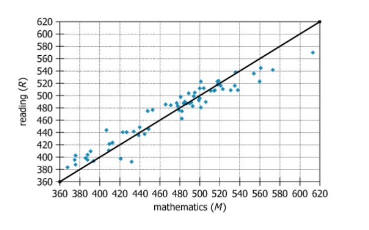
Students in 65 education systems worldwide took a global exam in reading, science, and mathematics. On the scatterplot, each of the 65 data points displays the average mathematics score (\(\mathrm{M}\)) and the average reading score (\(\mathrm{R}\)), both rounded to the nearest integer, for one of the education systems. The line represents all points where \(\mathrm{M}\) and \(\mathrm{R}\) are equal.
Based on the information provided, select from each drop-down menu the option that creates the most accurate statement.
Owning The Dataset
Table 1: Text Analysis
Text Component | Literal Content | Simple Interpretation |
---|---|---|
Subject Population | Students in 65 education systems worldwide | The data covers country/region-level education systems globally |
Exam Subjects | Reading, science, and mathematics | Three academic areas were tested, but only two are shown here |
Data Points | 65 data points, each with average mathematics \(\mathrm{(M)}\) and reading \(\mathrm{(R)}\) score | Each point on the chart represents a system's average \(\mathrm{M}\) and \(\mathrm{R}\) scores |
Score Rounding | Scores rounded to nearest integer | All reported scores are integers, not decimals |
Reference Line Description | The line represents all points where \(\mathrm{M}\) and \(\mathrm{R}\) are equal | This diagonal visually separates systems stronger in \(\mathrm{M}\) or \(\mathrm{R}\) |
Table 2: Chart Analysis
Chart Component | What's Shown | What This Indicates |
---|---|---|
Axes | X-axis: Mathematics scores (360–620), Y-axis: Reading (360–620) | Both subjects use the same scale, allowing direct comparison |
Data Points | 65 points scattered near and below the diagonal \(\mathrm{M=R}\) line | Most education systems score higher in math than reading |
Diagonal Line | Black line from \(\mathrm{(360,360)}\) to \(\mathrm{(620,620)}\) (where \(\mathrm{M=R}\)) | Points below: \(\mathrm{M\gt R}\); points above: \(\mathrm{R\gt M}\) |
Distribution | Many points cluster just below the diagonal line | Slight overall edge in mathematics performance |
Score Range | Points span roughly from 380 to 620 | Substantial variation in average scores across education systems |
Key Insights
- Most education systems achieve higher average scores in mathematics than in reading, as indicated by the majority of data points lying below the \(\mathrm{M=R}\) line.
- Mathematics and reading scores are strongly correlated at the system level: countries strong in one tend to be strong in the other.
- Only a small number of education systems perform better in reading than in mathematics, shown by their position above the diagonal line.
- There is substantial variability between systems, with average scores ranging over about 240 points (from around 380 to 620 on both subjects).
Step-by-Step Solution
Question 1: Percent of Education Systems Where M > R
Complete Statement:
The percent of the 65 education systems for which the value of \(\mathrm{M}\) exceeds the value of \(\mathrm{R}\) is between [BLANK 1] percent.
Breaking Down the Statement
- Statement Breakdown 1:
- Key Phrase: percent of the 65 education systems
- Meaning: We are being asked about the percentage out of all 65 education systems.
- Relation to Chart: Each dot on the scatter plot represents one education system, so we are considering all dots.
- Important Implications: To answer, we need to count or estimate how many dots fall into a certain category and express that count as a percent.
- Statement Breakdown 2:
- Key Phrase: value of \(\mathrm{M}\) exceeds the value of \(\mathrm{R}\)
- Meaning: Mathematics score \(\mathrm{(M)}\) is greater than Reading score \(\mathrm{(R)}\) for an education system.
- Relation to Chart: On the scatter plot, these systems are represented by dots below the diagonal \(\mathrm{M = R}\) line.
- Important Implications: Only count dots below the diagonal; points on the line (where \(\mathrm{M = R}\)) do not count.
- What is needed: We need to find what percentage of the 65 education systems have their dots below the diagonal line.
Solution:
- Condensed Solution Implementation:
Estimate the number of dots below the diagonal line and convert this count into a percentage of the total 65 systems. - Necessary Data points:
Estimate the number of systems (dots) below the diagonal line in the scatter plot. Visual inspection suggests about 15 to 20 out of 65.- Calculations Estimations:
15/65 ≈ 23%, 20/65 ≈ 31%. So, the estimated percentage is between 23% and 31%. - Comparison to Answer Choices:
This estimate fits into the '25 and 50' percent interval.
- Calculations Estimations:
FINAL ANSWER Blank 1: 25 and 50
Question 2: Interval for Maximum R-M Difference
Complete Statement:
The value of \(\mathrm{R}\) exceeds the value of \(\mathrm{M}\) by the greatest amount for the education system for which the value of \(\mathrm{R}\) is in the interval from [BLANK 2].
Breaking Down the Statement
- Statement Breakdown 1:
- Key Phrase: \(\mathrm{R}\) exceeds the value of \(\mathrm{M}\) by the greatest amount
- Meaning: Looking for the largest value of \(\mathrm{(R - M)}\) among all the systems.
- Relation to Chart: This will be the dot furthest vertically above the diagonal \(\mathrm{(M = R)}\) line.
- Statement Breakdown 2:
- Key Phrase: the value of \(\mathrm{R}\) is in the interval from
- Meaning: Identify the interval that contains the reading score \(\mathrm{(R)}\) for that education system.
- Relation to Chart: Read the y-coordinate \(\mathrm{(R}\) value) of the farthest-above-diagonal dot and match it to the appropriate interval.
- What is needed: We need to find which \(\mathrm{R}\) interval contains the system where \(\mathrm{R - M}\) is the largest.
Solution:
- Condensed Solution Implementation:
Identify the dot farthest above the diagonal and check its \(\mathrm{R}\) value to determine which interval it falls in. - Necessary Data points:
The farthest-above-diagonal dot appears to have an \(\mathrm{R}\) value near 450.- Calculations Estimations:
Estimate: If \(\mathrm{M}\) ≈ 420 and \(\mathrm{R}\) ≈ 450, \(\mathrm{R - M}\) ≈ 30. This \(\mathrm{R}\) value (about 450) is the largest such positive difference seen on the plot. - Comparison to Answer Choices:
450 fits within the '440 to 460' interval provided.
- Calculations Estimations:
FINAL ANSWER Blank 2: 440 to 460
Summary
To answer both questions, examine the position of dots relative to the diagonal line in the scatter plot. For question 1, estimate the percent of dots below the line; for question 2, find the dot farthest above the line and identify its \(\mathrm{R}\) interval. Both solutions rely on visual pattern recognition and approximate counting.
Question Independence Analysis
The questions are independent: the first is about how many systems have \(\mathrm{M \gt R}\), while the second is about which system has the greatest \(\mathrm{R - M}\) difference. Answering one does not require knowing the answer to the other.