e-GMAT Logo
NEUR
N

Researchers conducted a survey of corporations in a particular industry to determine, for each of four industry-accepted best practices—Practices A,...

GMAT Graphics Interpretation : (GI) Questions

Source: Mock
Graphics Interpretation
GI - Advanced
MEDIUM
...
...
Notes
Post a Query
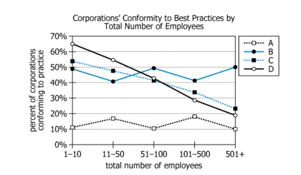
Graph showing corporate conformity to industry best practices by company size

Researchers conducted a survey of corporations in a particular industry to determine, for each of four industry-accepted best practices—Practices A, B, C, and D—how prevalent conformity to that practice is. The researchers grouped the corporations according to the total number of people each employs, including an equal number in each group. For each practice, the graph shows the conformity as the percent of corporations in each group that conform to the practice. For example, the graph shows that approximately 50% of the corporations with greater than 500 employees conform to Practice B.


Select the options from the drop-down menus to complete the statement so that it most accurately reflects the information provided.

The graphic shows a strong positive correlation between conformity to Practiceand conformity to Practice
Solution

Owning The Dataset

Table 1: Text Analysis

Text ComponentLiteral ContentSimple Interpretation
Study SubjectResearchers conducted a survey of corporations in a particular industryThe study looks at companies within a specific industry
Variable MeasuredFor each of four industry-accepted best practices—Practices A, B, C, and D—how prevalent conformity to that practice isResearchers recorded the percentage of companies following each best practice
Grouping MethodThe researchers grouped the corporations according to the total number of people each employsCompanies are grouped by how many employees they have
Group StructureIncluding an equal number in each groupEach employee-size group has the same number of companies
VisualizationFor each practice, the graph shows the conformity as the percent of corporations in each group that conform to the practiceThe graph plots what percentage in each group uses each practice
Example InterpretationApproximately 50% of the corporations with greater than 500 employees conform to Practice BHalf of the largest companies follow Practice B

Table 2: Chart Analysis

Chart ComponentWhat is shownSimple Interpretation
Chart TypeLine chart with 4 lines (A, B, C, D)Used to compare trends for each practice across company sizes
X-Axis5 employee count groups (1-10, 11-50, 51-100, 101-500, 501+)Companies are split from smallest to largest
Y-AxisPercent conformity (0%-70%)Shows what percent of companies conform in each group
Practice A PatternValues consistently low (10-18%) across all groupsVery few companies use Practice A, regardless of size
Practice B PatternFairly flat/stable (41-50%) across all groupsAbout half use Practice B, regardless of company size
Practice C PatternDrops from 53% (smallest) to 24% (largest)Smaller companies more likely to use Practice C
Practice D PatternDrops from 65% (smallest) to 19% (largest)Smaller companies more likely to use Practice D
Notable CorrelationC and D lines decrease togetherC and D conformity strongly positively correlated

Key Insights

Practices C and D both show a strong positive correlation: conformity to each drops together as company size increases. Both C and D are used by most small companies but far fewer large ones. Practice B is adopted by about half of all companies regardless of size, and Practice A always has low adoption.

Step-by-Step Solution

Question 1: Determining the Practice with Strong Positive Correlation

Complete Statement:

The graphic shows a strong positive correlation between conformity to Practice [A/B/C]

Breaking Down the Statement
  • Statement Breakdown 1:
    • Key Phrase: strong positive correlation
      • Meaning: A relationship where as one variable increases or decreases, the other does the same
      • Relation to Chart: The chart shows lines for Practice A, B, C, and D over company size groups
      • Important Implications: We need to identify two practices whose conformity percentages rise and fall together
  • Statement Breakdown 2:
    • Key Phrase: conformity to Practice [A/B/C]
      • Meaning: One of the first three practices is part of a correlated pair
      • Relation to Chart: Visually check which practice lines change together
      • Important Implications: Pick A, B, or C based on pattern similarity to another practice
  • What is needed: Which practice (A, B, or C) is involved in the strong positive correlation shown by the chart
Solution:
  • Condensed Solution Implementation:
    Analyze the pattern of each practice's line—you want to match the one that has the strongest paired up-and-down movement with another line.
  • Necessary Data points:
    Practice C (53% to 24%) and Practice D (65% to 19%) both decrease steadily and similarly across group sizes.
    • Calculations Estimations:
      Both start high and decrease sharply; A is always low, and B holds steady. This parallel decline means C and D are strongly positively correlated.
    • Comparison to Answer Choices:
      C is the only candidate among A, B, C that fits this pattern according to the graphic.
FINAL ANSWER Blank 1: C

Question 2: Identifying What Practice C is Correlated With

Complete Statement:

The graphic shows a strong positive correlation between conformity to Practice C and conformity to Practice [conformity to Practice D/total number of employees/number of corporations in the groups]

Breaking Down the Statement
  • Statement Breakdown 1:
    • Key Phrase: conformity to Practice C
      • Meaning: Looking for what variable Practice C tracks closely with
      • Relation to Chart: C decreases as company size increases
  • Statement Breakdown 2:
    • Key Phrase: conformity to Practice [D/total number of employees/number of corporations]
      • Meaning: The other variable involved in the correlation
      • Relation to Chart: Possible variables: D's line (which also decreases), employee number (inverse trend), corporation count (not variable across chart)
  • What is needed: Which among the answer options is most strongly positively correlated with Practice C
Solution:
  • Condensed Solution Implementation:
    Check which variable moves in sync with Practice C—the answer must be the one whose line matches C's fall.
  • Necessary Data points:
    Practice D's line very closely tracks C's on the chart.
    • Calculations Estimations:
      Both drop as group size increases, so conformity to D is positively correlated with C. Employee numbers move oppositely (negative correlation), and corporation count does not show a pattern.
    • Comparison to Answer Choices:
      The only matching answer is 'conformity to Practice D'.
FINAL ANSWER Blank 2: conformity to Practice D

Summary

Both blanks center on the strong, parallel downward trend between Practice C and Practice D conformity rates over increasing company size. Therefore, the graphic's strong positive correlation is between conformity to Practice C and conformity to Practice D.

Question Independence Analysis

The answer to question 2 is dependent on the answer to question 1. Once you determine Practice C in blank 1, it directly leads to finding its correlated pair (conformity to Practice D) in blank 2.

Answer Choices Explained
The graphic shows a strong positive correlation between conformity to Practice
1A
A
1B
B
1C
C
and conformity to Practice
2A
conformity to Practice D
2B
total number of employees
2C
number of corporations in the groups
Rate this Solution
Tell us what you think about this solution
...
...
Forum Discussions
Start a new discussion
Post
Load More
Similar Questions
Finding similar questions...
Previous Attempts
Loading attempts...
Similar Questions
Finding similar questions...
Parallel Question Generator
Create AI-generated questions with similar patterns to master this question type.