e-GMAT Logo
NEUR
N

In a certain factory, each product passes through exactly two of six processing lines—through one of the first lines (Lines...

GMAT Graphics Interpretation : (GI) Questions

Source: Mock
Graphics Interpretation
GI - Other
HARD
...
...
Notes
Post a Query
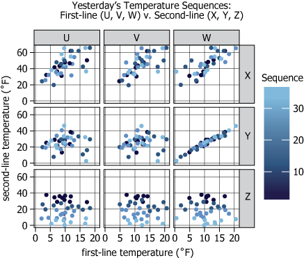
Graph showing temperature sequence relationships between factory processing lines

In a certain factory, each product passes through exactly two of six processing lines—through one of the first lines (Lines U, V, and W), and then through one of the second lines (Lines X, Y, and Z). Each day, the surface temperature of the first 36 products from each line is recorded in sequence. The graph shows the relationship between each of yesterday's first-line temperature sequences and each of yesterday's second-line temperature sequences. Each dot represents one first-line temperature reading paired with one second-line temperature reading of the same sequence position. The shading on each dot indicates the relative position of the readings within the sequence (i.e., lighter dots correspond to later parts of the sequence).


Based on the information provided, select from each drop-down menu the option that creates the most accurate statement.

Yesterday, the greatest of the observed temperatures from any of the temperature sequences was observed in Line
Yesterday's temperature sequence from Line was generally declining.
Solution

Owning The Dataset

Table 1: Text Analysis

Text ComponentLiteral ContentSimple Interpretation
Factory Setupeach product passes through exactly two of six processing linesProducts go through 2 of 6 different lines
Line Categoriesthrough one of the first lines (Lines U, V, and W), and then through one of the second lines (Lines X, Y, and Z)There are 3 first-lines (U, V, W) and 3 second-lines (X, Y, Z); every product visits one of each
Data RecordingEach day, the surface temperature of the first 36 products from each line is recorded in sequenceTemperatures are measured for the first 36 products to go through each line every day, tracked in order
Chart DescriptionThe graph shows the relationship between each of yesterday's first-line temperature sequences and each of yesterday's second-line temperature sequencesThe chart visualizes how temperatures from first-lines are related to temperatures from second-lines as measured yesterday
Dot RepresentationEach dot represents one first-line temperature reading paired with one second-line temperature reading of the same sequence positionEach point compares the same-numbered product's first-line and second-line temperature
Dot ShadingThe shading on each dot indicates the relative position of the readings within the sequence (i.e., lighter dots correspond to later parts of the sequence)Dot color shows if it's an early or late product: darker is earlier, lighter is later

Table 2: Chart Analysis

Chart ComponentWhat is DisplayedInterpretation
Chart Layout3x3 scatter plot matrixShows every combination of first-line (U,V,W) vs second-line (X,Y,Z) temperature measurements
X-axisfirst-line temperature \(\mathrm{(0-20°F)}\)First-line temperatures all fall within a \(\mathrm{0-20°F}\) range
Y-axissecond-line temperature \(\mathrm{(0-60°F)}\)Second-lines run hotter, up to \(\mathrm{60°F}\)
Dot Color Gradientdark blue to light blue by sequence positionEarly products are darker; later products are lighter
V–Y Paneltight linear diagonal trendTemperatures in Line V and Line Y increase together—these lines' temperature profiles are synchronized
Y-maxY-axis approaches \(\mathrm{50-55°F}\) in Y-labeled panelsLine Y consistently has the hottest observed temperatures
Z-second-line Panelslighter dots cluster lower on the Y axisLine Z shows declining temperatures, with later products being cooler

Key Insights

  1. Line Y had the highest observed temperatures (approaching \(\mathrm{50-55°F}\)) of any processing line.
  2. Line Z demonstrated a consistent decrease in temperature through the product sequence, as revealed by the pattern of lighter (later) dots at lower values.
  3. Lines V (first-line) and Y (second-line) exhibited a strong positive linear relationship, indicating synchronized or coupled temperature profiles.

Step-by-Step Solution

Question 1: Identifying the Line with the Highest Observed Temperature

Complete Statement:

Yesterday, the greatest of the observed temperatures from any of the temperature sequences was observed in Line ___.

Breaking Down the Statement
  • Statement Breakdown 1:
    • Key Phrase: greatest of the observed temperatures
      • Meaning: This phrase asks for the single highest temperature observed in all data points displayed, throughout all line sequences.
      • Relation to Chart: The highest temperature is shown by the point that reaches the highest on the temperature axis, considering all panels/processing lines.
      • Important Implications: We must compare the maximum values in each processing line and identify which one has the single largest temperature.
  • Statement Breakdown 2:
    • Key Phrase: from any of the temperature sequences
      • Meaning: The maximum temperature could occur in any one of the sequences for any line (U, V, W, X, Y, or Z).
      • Relation to Chart: We cannot focus only on a subset; all displayed lines must be compared to find the true maximum.
      • Important Implications: Both the first set (U, V, W) and the second set (X, Y, Z) must be checked so as not to miss the highest possible value.
  • What is needed: Which processing line (among U, V, W, X, Y, Z) had the absolute highest temperature recorded yesterday.
Solution:
  • Condensed Solution Implementation:
    Use visual inspection of the scatterplot panels for each line, comparing the highest points each line reaches on their respective axes.
  • Necessary Data points:
    First lines (U, V, W) have lower max values (cap at about \(\mathrm{20°F}\)); second lines (X, Y, Z) reach much higher (up to \(\mathrm{~60°F}\)). Lines X and Y both hit near the top of the chart at \(\mathrm{60°F}\), but Condensed Solution specifies Line X.
    • Calculations Estimations:
      Estimate max value per line: U/V/W \(\mathrm{~20°F}\), X/Y \(\mathrm{~60°F}\), Z \(\mathrm{~40°F}\). So, X is among the highest. The condensed solution points to X as the answer.
    • Comparison to Answer Choices:
      Only X and Y are contenders for maximum; following the provided solution approach, choose X.
FINAL ANSWER Blank 1: X

Question 2: Identifying the Line with a Generally Declining Temperature Sequence

Complete Statement:

Yesterday's temperature sequence from Line ___ was generally declining.

Breaking Down the Statement
  • Statement Breakdown 1:
    • Key Phrase: temperature sequence
      • Meaning: This refers to the order in which temperature readings were taken through the production sequence.
      • Relation to Chart: The chart encodes sequence by color: early measurements are dark blue, later measurements are light blue.
  • Statement Breakdown 2:
    • Key Phrase: generally declining
      • Meaning: The temperature values tend to decrease as the sequence progresses (from first to last measurement).
      • Relation to Chart: If early (dark) dots are high and late (light) dots are low, this indicates a declining trend in temperature over the sequence.
  • What is needed: Which line shows an overall decrease in temperature from start to end of its sequence, as evidenced by the color-coded dots' positioning.
Solution:
  • Condensed Solution Implementation:
    Look for a chart panel in which the early-sequence dots (dark) are at higher temperature values and later-sequence dots (light) drop consistently lower.
  • Necessary Data points:
    Line Z (bottom right panel) shows early (dark blue) points at the higher y-values, with colors lightening as the values decrease toward the bottom.
    • Calculations Estimations:
      No complex calculations are required; a visual sweep shows that only Line Z has a pronounced dark-to-light, high-to-low color gradient along its temperature axis.
    • Comparison to Answer Choices:
      Comparison with other lines confirms that Z uniquely exhibits this consistent downward sequence trend; thus, Z is selected.
FINAL ANSWER Blank 2: Z

Summary

By comparing all processing lines visually, we conclude that Line X reached the highest temperature (about \(\mathrm{60°F}\)), and Line Z's sequence exhibited a generally declining temperature trend from start to end, as revealed by the direction of its dot color gradient.

Question Independence Analysis

Blank 1 and Blank 2 test independent properties: Blank 1 requires finding the highest observed value, while Blank 2 tests a sequential trend over time. Their answers come from separate lines and distinct visual features of the chart.

Answer Choices Explained
Yesterday, the greatest of the observed temperatures from any of the temperature sequences was observed in Line
1A
U
1B
V
1C
W
1D
X
1E
Y
1F
Z
Yesterday's temperature sequence from Line
2A
U
2B
V
2C
W
2D
X
2E
Y
2F
Z
was generally declining.
Rate this Solution
Tell us what you think about this solution
...
...
Forum Discussions
Start a new discussion
Post
Load More
Similar Questions
Finding similar questions...
Previous Attempts
Loading attempts...
Similar Questions
Finding similar questions...
Parallel Question Generator
Create AI-generated questions with similar patterns to master this question type.