e-GMAT Logo
NEUR
N

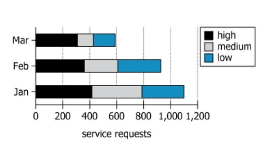
For each of the first three months of last year, the graph shows the number of service requests handled by...

GMAT Graphics Interpretation : (GI) Questions

Source: Official Guide
Graphics Interpretation
GI - Stats
EASY
...
...
Notes
Post a Query
Graph showing service requests by priority level

For each of the first three months of last year, the graph shows the number of service requests handled by the Technical Services department at a certain company and the number of those service requests that were high, medium, or low priority. For example, the graph shows that in March, the department handled approximately 590 requests: approximately 310 high priority, 120 medium priority, and 160 low priority.


Select the options from the drop-down menus that create the statement that is most strongly supported by the information provided.

Among the three months shown, the month for which high-priority requests constituted the greatest proportion of the total number of requests for the month is, and that month hadtotal number of requests, among the three.
Solution

Owning The Dataset

Table 1: Text Analysis

Text ComponentLiteral ContentSimple Interpretation
Time PeriodFor each of the first three months of last yearData is for January, February, and March of the previous year
DepartmentTechnical Services department at a certain companyThe department involved is Technical Services at a specific (unnamed) company
MeasurementNumber of service requests handledThe chart/graph displays the count of service requests processed
Categories of PriorityHigh, medium, or low priorityEach request is classified by level of urgency: high, medium, or low
Example GivenIn March... handled approximately 590 requests: approximately 310 high, 120 medium, and 160 low priorityMarch had about 590 requests split into three categories as an illustration of how to interpret the data shown

Table 2: Chart Analysis

Chart ComponentDescriptionWhat This Tells Us
Chart TypeStacked bar chart, horizontal orientationAllows comparison of total and segment breakdown by month
X-AxisNumber of service requests (0 to 1200, marked every 200)Shows request volume scale; useful for approximating totals
Y-AxisMonths: Jan, Feb, Mar (from bottom to top)Displays time trend over first three months
Color CodingHigh (black), Medium (gray), Low (blue)Distinguishes request priority visually
Bar ValuesJan: 1100 (420 high, 360 medium, 320 low); Feb: 920 (360, 240, 320); Mar: 600 (300, 120, 180)Shows monthly totals and breakdown by priority
PatternsProportion of high-priority increases as total dropsPriority mix changes over time

Key Insights

Over the first three months, the total number of service requests handled by the department decreased steadily: from 1100 in January, to 920 in February, to 600 in March. While overall requests dropped, the proportion of high-priority requests was highest in March at 50% (300 out of 600). This shift indicates that even as total demand fell, the share of urgent (high-priority) work increased. Medium and low priority requests became a smaller relative share, and the pronounced black segment (high-priority) in March's bar on the chart visually highlights this change.

Step-by-Step Solution

Question 1: Finding the Month with Greatest High-Priority Proportion

Complete Statement:

Among the three months shown, the month for which high-priority requests constituted the greatest proportion of the total number of requests for the month is [BLANK 1]

Breaking Down the Statement
  • Statement Breakdown 1:
    • Key Phrase: high-priority requests constituted the greatest proportion
      • Meaning: We are being asked which month had the highest percentage of requests that were high-priority compared to that month's total requests.
      • Relation to Chart: Each month's bar is divided into segments; the high-priority segment's size (in black) relative to the total bar length shows this proportion.
      • Important Implications: It's not about the absolute number of high-priority requests, but about the percentage relative to the month's total requests.
  • Statement Breakdown 2:
    • Key Phrase: among the three months shown
      • Meaning: The comparison is limited to January, February, and March only.
      • Relation to Chart: These are the three months displayed as horizontal bars in the chart.
      • Important Implications: Comparisons must be made for all three months using their own data.

What is needed: Which month had the highest fraction of high-priority requests out of its total requests.

Solution:
  • Condensed Solution Implementation:
    For each month, divide the number of high-priority requests by the total number of requests to determine the proportion.
  • Necessary Data points:
    January: 420 high out of 1100 total; February: 360 high out of 920 total; March: 300 high out of 600 total.
    • Calculations Estimations:
      January: \(\frac{420}{1100} \approx 0.382\) \((38.2\%)\); February: \(\frac{360}{920} \approx 0.391\) \((39.1\%)\); March: \(\frac{300}{600} = 0.5\) \((50\%)\).
    • Comparison to Answer Choices:
      March has the highest proportion (50%) compared to February (39.1%) and January (38.2%).
FINAL ANSWER Blank 1: March

Question 2: Comparing That Month's Total Requests

Complete Statement:

and that month had [BLANK 2] total number of requests, among the three

Breaking Down the Statement
  • Statement Breakdown 1:
    • Key Phrase: that month
      • Meaning: Refers to the month identified in Blank 1, which is March.
      • Relation to Chart: We are now focusing specifically on March's data.
  • Statement Breakdown 2:
    • Key Phrase: total number of requests, among the three
      • Meaning: Compare March's total requests with January's and February's totals.
      • Relation to Chart: Check the lengths (endpoints) of each month's horizontal bar.

What is needed: Does March have the least, the most, or neither the greatest nor the least total requests among the three months?

Solution:
  • Condensed Solution Implementation:
    Compare March's total request number with the other months.
  • Necessary Data points:
    January: 1100; February: 920; March: 600.
    • Calculations Estimations:
      March has 600 requests, which is fewer than February (920) and January (1100).
    • Comparison to Answer Choices:
      March has the least total requests of the three months.
FINAL ANSWER Blank 2: the least

Summary

March was the month when high-priority work made up the largest share of all requests (50%), despite having the smallest total number of requests. This shows that even as the overall number of requests went down, the urgency or seriousness of those requests increased.

Question Independence Analysis

Question 2 directly depends on the answer to Question 1, as 'that month' refers to the month chosen previously. Therefore, the questions are not independent.

Answer Choices Explained
Among the three months shown, the month for which high-priority requests constituted the greatest proportion of the total number of requests for the month is
1A
January
1B
February
1C
March
, and that month had
2A
the least
2B
neither the greatest nor the least
2C
the greatest
total number of requests, among the three.
Rate this Solution
Tell us what you think about this solution
...
...
Forum Discussions
Start a new discussion
Post
Load More
Similar Questions
Finding similar questions...
Previous Attempts
Loading attempts...
Similar Questions
Finding similar questions...
Parallel Question Generator
Create AI-generated questions with similar patterns to master this question type.