e-GMAT Logo
NEUR
N

For each of the 22 faculty members in a university's statistics department, the graph shows the faculty member's monthly salary,...

GMAT Graphics Interpretation : (GI) Questions

Source: Mock
Graphics Interpretation
GI - Other
HARD
...
...
Notes
Post a Query
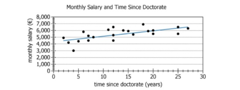
Graph showing faculty salary data versus years since doctorate

For each of the 22 faculty members in a university's statistics department, the graph shows the faculty member's monthly salary, in euros (€), and time since doctorate- the number of years since that faculty member earned his or her doctorate in statistics. The graph also shows a trend line for the data.

From each drop-down menu, select the option that creates the most accurate statement based on the information provided.

The trend line suggests that, for a faculty member whose time since doctorate is at least 2 years, each 1-year increase in time since doctorate corresponds to an increase, to the nearest €10,of monthly salary.
For the faculty member whose monthly salary is greatest, the time since doctorate isyears.
Solution

Owning the Dataset

Table 1: Text Analysis

Text Component Literal Content Simple Interpretation
Subject Matter 22 faculty members in a university's statistics department Examines salary and experience of all 22 department faculty members
Y-axis Variable monthly salary, in euros (\(€\)) How much each faculty member earns monthly in euros
X-axis Variable time since doctorate - number of years since earning their doctorate in statistics Counts years since each professor received their PhD in statistics
Additional Feature the graph also shows a trend line for the data Trend line illustrates average relationship between salary and experience

Table 2: Chart Analysis

Chart Component What's Shown Interpretation
Chart Type Scatter plot with trend (regression) line Each dot = one faculty member; line shows average trend
X-axis Range 0 to 30 years since doctorate Experience levels from new to 30 years post-doctorate
Y-axis Range \(€0\) to \(€8,000\) monthly salary Faculty salaries cover wide range; most between \(€3,000\) and \(€7,000\)
Data Points 22 black dots Data represents all faculty members in department
Trend Line Slope Positive, about \(€80\) per year Average salary increases \(€80\)/month for each additional year
Data Spread Points scattered above and below trend line Substantial variation in salaries not explained by experience alone

Key Insights

  1. On average, each additional year since earning a doctorate is associated with about \(€80\) higher monthly salary, according to the trend line.
  2. The highest paid faculty member earns about \(€7,000\) per month with roughly 18 years of post-doctorate experience, but salary does not steadily increase for all.
  3. Significant variation exists around the trend line, indicating that factors other than years since doctorate (such as field, rank, performance, or negotiation) strongly affect salary.

Step-by-Step Solution

Question 1: Interpreting the Trend Line: Salary Increase per Year

Complete Statement:

The trend line suggests that, for a faculty member whose time since doctorate is at least 2 years, each 1-year increase in time since doctorate corresponds to an increase, to the nearest \(€10\), [BLANK 1] of monthly salary.

Breaking Down the Statement
  • Statement Breakdown 1:
    • Key Phrase: trend line suggests
      • Meaning: The answer should be based on the trend line (not individual points).
      • Relation to Chart: The blue line summarizing overall salary experience.
      • Important Implications: We're finding the general average increase, not any specific person's salary increase.
  • Statement Breakdown 2:
    • Key Phrase: each 1-year increase in time since doctorate
      • Meaning: We're examining how salary changes as years since doctorate increases by 1.
      • Relation to Chart: This is the slope of the trend line ('rise over run', salary per year).
      • Important Implications: We should find the amount the line rises for each year to get the answer.

What is needed: The average increase in salary (euros) that occurs for every one year increase in time since doctorate as shown by the trend line.

Solution:
  • Condensed Solution Implementation:
    Use two points far apart on the trend line to estimate the slope (change in salary divided by change in years).
  • Necessary Data points:
    Trend line at 5 years: \(€4,400\). Trend line at 25 years: \(€6,000\).
    • Calculations Estimations:
      Difference in salary: \(€6,000 - €4,400 = €1,600\). Difference in years: \(25 - 5 = 20\). Slope = \(€1,600 ÷ 20 = €80\) per year.
    • Comparison to Answer Choices:
      Answer choices are 40, 70, and 80. Our calculation gives \(€80\), which matches the third choice.
FINAL ANSWER Blank 1: 80

Question 2: Identifying the Most Experienced Highest-Paid Faculty Member

Complete Statement:

For the faculty member whose monthly salary is greatest, the time since doctorate is [BLANK 2] years.

Breaking Down the Statement
  • Statement Breakdown 1:
    • Key Phrase: faculty member whose monthly salary is greatest
      • Meaning: Find the faculty member with the highest salary (highest vertical point on the chart).
      • Relation to Chart: Locate the single black dot farthest up the y-axis (salary axis).
  • Statement Breakdown 2:
    • Key Phrase: time since doctorate
      • Meaning: For this specific person, find their years since doctorate (the x-value of that dot).
      • Relation to Chart: Check the horizontal (x) position of the highest dot.

What is needed: The number of years since doctorate for the individual with the highest salary.

Solution:
  • Condensed Solution Implementation:
    Find the highest dot (salary) on the chart, then track down to the x-axis to read the corresponding years since doctorate.
  • Necessary Data points:
    The highest salary is shown as about \(€7,000\) per month.
    • Calculations Estimations:
      From the highest point, track straight down to the x-axis. It lines up very closely with 18 years.
    • Comparison to Answer Choices:
      Choices are 18, 20, 22, or 25. 18 matches our estimate.
FINAL ANSWER Blank 2: 18

Summary

To answer both questions, use the trend line for average increases (question 1) and find the outlier/highest point for the largest salary (question 2). This approach highlights the difference between analyzing overall trends and identifying specific data points.

Question Independence Analysis

The two questions are independent: the first requires interpreting the trend line for a general relationship, while the second requires identifying an individual data point. Knowing the answer to one does not provide information for the other.

Answer Choices Explained
The trend line suggests that, for a faculty member whose time since doctorate is at least 2 years, each 1-year increase in time since doctorate corresponds to an increase, to the nearest €10,
1A
40
1B
70
1C
80
of monthly salary.
For the faculty member whose monthly salary is greatest, the time since doctorate is
2A
18
2B
20
2C
22
2D
25
years.
Rate this Solution
Tell us what you think about this solution
...
...
Forum Discussions
Start a new discussion
Post
Load More
Similar Questions
Finding similar questions...
Previous Attempts
Loading attempts...
Similar Questions
Finding similar questions...
Parallel Question Generator
Create AI-generated questions with similar patterns to master this question type.