e-GMAT Logo
NEUR
N

For each of Six Internet-based companies and each of several years, the graph shows the average number of times per...

GMAT Graphics Interpretation : (GI) Questions

Source: Mock
Graphics Interpretation
GI - Stats
HARD
...
...
Notes
Post a Query
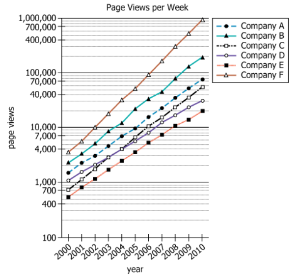
Graph showing average weekly home page views for six Internet companies over multiple years

For each of Six Internet-based companies and each of several years, the graph shows the average number of times per week the home page of the company was viewed. The vertical axis is in powers of 10.


Select from each drop down menu the option that creates the most accurate statement, given the information in the graph. 

Over the period depicted in the graph, the company that showed the least percentage increase in the average number of visits per week to the home page of its website is.
Over the period depicted in the graph, the company that showed the greatest percentage increase in the average number of visits per week to the home page of its website is.
Solution

Owning the Dataset

Table 1: Text Analysis

Text Component Literal Content Simple Interpretation
Subject Six Internet-based companies Data is about 6 different online companies
Timeframe Each of several years Information spans multiple years
Metric Average number of times per week the home page of the company was viewed Tracks typical weekly home page visits per company
Y-axis Description The vertical axis is in powers of 10 Number of visits are shown using a logarithmic (base 10) scale on the vertical axis

Table 2: Chart Analysis

Chart Component What's Shown What This Tells Us
Chart Type Line graph with 6 series, one for each company Trends in homepage visits for each company are compared over multiple years
X-axis Year (likely a continuous range, such as 2000-2010) Tracks long-term growth of homepage visits
Y-axis Scale Logarithmic (powers of 10) Accurately represents wide variations and percentage changes in visits
Comparative Pattern Varying slopes for each company Steeper slope equals higher percentage growth rate
Data Extent All lines rise, some much more steeply than others All companies saw growth, but at very different rates

Key Insights

  • The use of a logarithmic (powers of 10) vertical axis means lines of equal steepness reflect equal percentage increases, not raw increments.
  • Over the period shown, Company F had the greatest percentage increase in homepage visits (from 3,500 to 900,000; about a 257-fold increase).
  • Company D showed the least percentage increase (from 1,100 to 30,000; about a 27-fold increase), as indicated by a flatter line especially in later years.
  • All six companies experienced significant growth, but the differences in percentage growth are dramatic, as easily seen by comparing line slopes on the log scale.

Step-by-Step Solution

Question 1: Company with Least Percentage Increase

Complete Statement:

Over the period depicted in the graph, the company that showed the least percentage increase in the average number of visits per week to the home page of its website is [BLANK].

Breaking Down the Statement
  • Statement Breakdown 1:
    • Key Phrase: least percentage increase
      • Meaning: The smallest proportional (not absolute) growth over the period.
      • Relation to Chart: Corresponds to the company line with the flattest slope on the logarithmic y-axis.
      • Important Implications: A smaller percentage increase may still be a large absolute rise; focus on the proportional factor.
  • Statement Breakdown 2:
    • Key Phrase: over the period depicted
      • Meaning: Considers the full timeframe from 2000 to 2010.
      • Relation to Chart: Use the values at the endpoints (2000 and 2010) for each company.
      • Important Implications: Do not consider only intermediate spikes or drops.
  • What is needed: Identify the company whose visit numbers increased by the smallest percentage between 2000 and 2010.
Solution:
  • Condensed Solution Implementation:
    Compare the ratio (2010 value / 2000 value) for each company to determine which has the smallest growth factor (percentage increase).
  • Necessary Data points:
    Company D: ~1,100 in 2000, ~30,000 in 2010. Company A: ~1,600 in 2000, ~75,000 in 2010. Company E: ~550 in 2000, ~20,000 in 2010.
    • Calculations Estimations:
      Company D: \(30,000 ÷ 1,100 ≈ 27×\) increase. Company A: \(75,000 ÷ 1,600 ≈ 47×\). Company E: \(20,000 ÷ 550 ≈ 36×\).
    • Comparison to Answer Choices:
      Company D's growth factor (27x) is smaller than those of the other companies, confirming it had the least percentage increase.
FINAL ANSWER Blank 1: D

Question 2: Company with Greatest Percentage Increase

Complete Statement:

Over the period depicted in the graph, the company that showed the greatest percentage increase in the average number of visits per week to the home page of its website is [BLANK].

Breaking Down the Statement
  • Statement Breakdown 1:
    • Key Phrase: greatest percentage increase
      • Meaning: The largest proportional (not absolute) growth between 2000 and 2010.
      • Relation to Chart: Corresponds to the steepest upward slope on the logarithmic scale.
  • Statement Breakdown 2:
    • Key Phrase: over the period depicted
      • Meaning: Same full time span: 2000 to 2010.
      • Relation to Chart: Compare all companies' start and end values for the period.
  • What is needed: Identify the company whose visit numbers increased by the largest percentage from 2000 to 2010.
Solution:
  • Condensed Solution Implementation:
    Calculate the growth factor (2010 value / 2000 value) for each company and pick the largest.
  • Necessary Data points:
    Company F: ~3,500 in 2000, ~900,000 in 2010. Company B: ~2,200 in 2000, ~190,000 in 2010.
    • Calculations Estimations:
      Company F: \(900,000 ÷ 3,500 ≈ 257×\). Company B: \(190,000 ÷ 2,200 ≈ 86×\).
    • Comparison to Answer Choices:
      Company F's growth is the highest both visually and numerically, confirming it had the greatest percentage increase.
FINAL ANSWER Blank 2: F

Summary

By using the properties of a logarithmic scale, it is clear that Company D had the flattest growth (least percentage increase), while Company F had the steepest (greatest percentage increase) from 2000 to 2010. Calculated growth factors (D: ~27x, F: ~257x) confirm the visual assessment from the chart.

Question Independence Analysis

The two questions are independent: question 1 asks for the minimum, and question 2 asks for the maximum percentage growth, so the reasoning and answer to one do not affect the other. They are solved using the same approach but examine different extremes.

Answer Choices Explained
Over the period depicted in the graph, the company that showed the least percentage increase in the average number of visits per week to the home page of its website is
1A
A
1C
C
1D
D
1E
E
1F
F
.
Over the period depicted in the graph, the company that showed the greatest percentage increase in the average number of visits per week to the home page of its website is
2A
A
2C
C
2D
D
2E
E
2F
F
.
Rate this Solution
Tell us what you think about this solution
...
...
Forum Discussions
Start a new discussion
Post
Load More
Similar Questions
Finding similar questions...
Previous Attempts
Loading attempts...
Similar Questions
Finding similar questions...
Parallel Question Generator
Create AI-generated questions with similar patterns to master this question type.