Owning the Dataset
Table 1: Text Analysis
| Text Component |
Literal Content |
Interpretation |
| Subject |
Six Internet-based companies |
Data covers 6 named online companies |
| Time Span |
Each of several years |
Multiple years (timeline shown in chart, e.g., 2001-2010) |
| Metric |
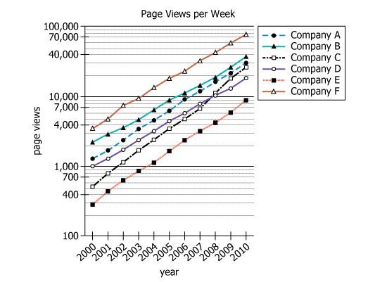
Average number of times per week the home page of a company was viewed |
Weekly homepage visit averages for each company |
| Y-axis Scale |
The vertical axis is in power of 10 |
Values represented on a logarithmic scale (powers of 10) |
Table 2: Chart Analysis
| Chart Feature |
Details |
Significance |
| Type |
Line graph with six series (one per company) |
Shows trends and comparison across companies |
| X-axis |
Years (e.g., 2001 to 2010) |
Tracks changes over several years |
| Y-axis |
Power of 10 (logarithmic scale), 100 to 100,000 |
Allows visualization of wide range of values |
| General Pattern |
All companies' lines trend upward |
Homepage visits increased for all companies |
| Max Growth Company |
Company F: \(5,000 \rightarrow 75,000\) views/week |
Largest net increase; line highest at all times |
| Min Growth Company |
Company E: \(460 \rightarrow 9,000\) views/week |
Smallest net increase; line consistently lowest |
Key Insights
- Company F showed the greatest net increase in homepage visits, growing by 70,000 average weekly views (from 5,000 to 75,000).
- Company E showed the least net increase, growing by only 8,540 (from 460 to 9,000 weekly views).
- The logarithmic (power-of-ten) scale makes absolute changes less visually obvious; similar line slopes may represent very different numeric increases.
Step-by-Step Solution
Question 1: Greatest Net Increase in Weekly Homepage Visits
Complete Statement:
Over the period depicted in the graph, the company that showed the greatest net increase in the average number of visits per week to the home page of its website is
Breaking Down the Statement
- Statement Breakdown 1:
- Key Phrase: Over the period depicted in the graph
- Meaning: We are concerned with the full time frame shown in the chart.
- Relation to Chart: Use the starting and ending points of each company's trend line in the graph.
- Important Implications: We need to review both the initial and final values for each company.
- Statement Breakdown 2:
- Key Phrase: greatest net increase
- Meaning: The largest absolute change in weekly homepage visits from the beginning to the end.
- Relation to Chart: Calculate: final number (in 2010) minus initial number (in 2001) for each company.
- Important Implications: We're searching for the company with the highest value after subtraction.
What is needed: Which company experienced the greatest increase in weekly homepage visits over the years covered.
Solution:
- Condensed Solution Implementation:
For each company, subtract the average weekly page views in 2001 from that in 2010. Identify which has the largest difference.
- Necessary Data points:
Company A: 1,800 (2001), 30,000 (2010); Company B: 2,900 (2001), 38,000 (2010); Company C: 800 (2001), 27,000 (2010); Company E: 460 (2001), 9,000 (2010); Company F: 5,000 (2001), 75,000 (2010).
- Calculations Estimations:
Company A: \(30,000 - 1,800 = 28,200\); Company B: \(38,000 - 2,900 = 35,100\); Company C: \(27,000 - 800 = 26,200\); Company E: \(9,000 - 460 = 8,540\); Company F: \(75,000 - 5,000 = 70,000\).
- Comparison to Answer Choices:
Company F has the largest net increase with 70,000, which is much more than any other company.
FINAL ANSWER Blank 1: Company F
Question 2: Least Net Increase in Weekly Homepage Visits
Complete Statement:
Over the period depicted in the graph, the company that showed the least net increase in average number of visits per week to the home page of its website is
Breaking Down the Statement
- Statement Breakdown 1:
- Key Phrase: least net increase
- Meaning: The smallest absolute change from start to finish in weekly homepage visits.
- Relation to Chart: Calculate the net increase for each company, and find the smallest value.
- Statement Breakdown 2:
- Key Phrase: average number of visits per week
- Meaning: The value we compare for every company.
- Relation to Chart: Y-axis data; compare the numerical changes directly.
What is needed: Which company had the smallest increase in weekly homepage views between 2001 and 2010.
Solution:
- Condensed Solution Implementation:
Use the same calculation as above: final minus initial value for each company; select the smallest result.
- Necessary Data points:
Company A: 28,200; Company B: 35,100; Company C: 26,200; Company E: 8,540; Company F: 70,000 (all calculated as above).
- Calculations Estimations:
Company E had an increase of 8,540, which is the lowest among all companies compared.
- Comparison to Answer Choices:
Company E's increase (8,540) is much less than the next lowest (Company C: 26,200), so Company E is correct.
FINAL ANSWER Blank 2: Company E
Summary
By directly comparing each company's weekly homepage visits in 2001 and 2010, we found: Company F had the largest increase (70,000), while Company E had the smallest (8,540). This straightforward data comparison answers both blanks clearly.
Question Independence Analysis
Although both questions use the same calculation and data, the first asks for the greatest net increase and the second for the least net increase. Thus, each question can be solved independently by looking for the largest and smallest differences, respectively.
