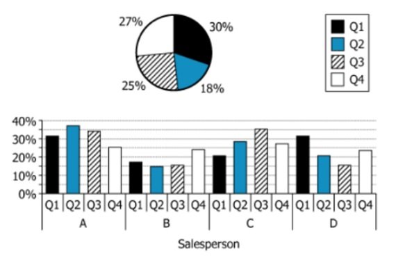
For a certain retail store, the pie chart shows the percent of the last complete fiscal year's total revenue that...
GMAT Graphics Interpretation : (GI) Questions

For a certain retail store, the pie chart shows the percent of the last complete fiscal year's total revenue that was generated during each quarter; the bar graph shows, for each of the store's four salespeople, the percent of each quarter's revenue that was generated by that salesperson. For example, the pie chart shows that the store's revenue generated in Q1 constituted 30% of its total revenue for the year, and the bar graph shows that Salesperson A generated 31% of the store's revenue for Q1.
Select from the drop-down menus the options that complete the statement so that it is accurate based on the information provided.
Owning The Dataset
Table 1: Text Analysis
| Text Component | Literal Content | Simple Interpretation |
|---|---|---|
| Column Height Meaning | The height of the column represents the total annual volume of precipitation | Taller column = more precipitation received |
| Data Metrics | evaporation \(\mathrm{(\%)}\) → runoff \(\mathrm{(\%)}\) | Shows what % of precipitation leaves each continent via evaporation vs runoff |
| Geographic Coverage | North America, South America, Europe, Africa, Asia, Australia & Oceania | All six populated continents are included |
| Data Type | Total annual volume \(\mathrm{(km^3/year)}\), percentages | Gives both absolute and relative water movement information |
Table 2: Chart Analysis
| Chart Component | What's Shown | Interpretation |
|---|---|---|
| 3D Column Chart | Paired columns per continent: orange (evaporation %) and red (runoff %) | Each continent shows water loss divided by evaporation and runoff |
| Column Heights | Scaled to total annual precipitation (ranging \(\mathrm{7,080}\) to \(\mathrm{32,200\ km^3}\)) | Highlights large variation in precipitation across continents |
| Percentage Labels | \(\mathrm{20\%-80\%}\) labels on columns | Evaporation is always higher than runoff, especially in Africa |
| Map Layout | Plotted on a world map by continent | Visually connects data to global geography |
| Color Legend | Orange arrow = evaporation %, Red arrow = runoff % | Aids in quickly distinguishing data types |
Key Insights
- Africa has the highest evaporation rate \(\mathrm{(80\%)}\) and lowest runoff \(\mathrm{(20\%)}\), indicating most precipitation returns to the atmosphere rather than flowing to oceans.
- Asia receives the highest total precipitation \(\mathrm{(32,200\ km^3/year)}\), nearly five times that of Australia & Oceania \(\mathrm{(7,080\ km^3/year)}\).
- On all continents, evaporation exceeds runoff, and the two always sum to \(\mathrm{100\%}\), demonstrating the dual paths of precipitation loss.
Step-by-Step Solution
Question 1: Identifying the Top Q3 Performer
Complete Statement:
Of the four salespeople, Salesperson [BLANK 1] generated the most revenue in Q3
Breaking Down the Statement
- Statement Breakdown 1:
- Key Phrase: Of the four salespeople
- Meaning: We are comparing among Salespeople A, B, C, and D.
- Relation to Chart: The bar graph displays data for all four salespeople.
- Important Implications: All four must be considered for Q3 performance.
- Statement Breakdown 2:
- Key Phrase: generated the most revenue in Q3
- Meaning: Looking for the salesperson with the highest Q3 revenue.
- Relation to Chart: Check which bar is tallest in Q3 segment.
- Important Implications: Visual inspection is sufficient to determine the highest performer.
- What is needed: Which salesperson had the highest revenue in Q3.
Solution:
- Condensed Solution Implementation:
Find the highest Q3 bar on the graph and match it to the corresponding salesperson. - Necessary Data points:
Heights of Q3 bars for all four salespeople on the bar graph.- Calculations Estimations:
Direct visual comparison of Q3 bar heights. - Comparison to Answer Choices:
Salesperson C has the highest Q3 revenue bar; thus, the answer is C.
- Calculations Estimations:
FINAL ANSWER Blank 1: C
Question 2: Calculating Q3 Contribution to Annual Revenue
Complete Statement:
the revenue generated by that salesperson in Q3 constitutes, to the nearest 5 percent, [BLANK 2] percent of the store's total revenue generated during the last complete fiscal year
Breaking Down the Statement
- Statement Breakdown 1:
- Key Phrase: revenue generated by that salesperson in Q3
- Meaning: The revenue amount by Salesperson C in Q3.
- Relation to Chart: This involves Salesperson C's Q3 bar (percentage of Q3 revenue) and Q3's share of annual revenue (from pie chart).
- Statement Breakdown 2:
- Key Phrase: percent of the store's total revenue
- Meaning: What fraction of the annual revenue is Salesperson C's Q3 revenue?
- Relation to Chart: Multiply Q3's percent of annual revenue by C's percent of Q3 revenue.
- What is needed: The overall percent of annual revenue accounted for by Salesperson C in Q3.
Solution:
- Condensed Solution Implementation:
Multiply Q3's percent of annual revenue by Salesperson C's percent of Q3 revenue and round to the nearest 5%. - Necessary Data points:
Q3 is \(\mathrm{30\%}\) of total revenue (pie chart); Salesperson C generated roughly \(\mathrm{33\%}\) of Q3 revenue (bar graph).- Calculations Estimations:
\(\mathrm{0.30 \times 0.33 = 0.099}\) or about \(\mathrm{10\%}\) when rounded. - Comparison to Answer Choices:
\(\mathrm{10\%}\) matches one of the available options.
- Calculations Estimations:
FINAL ANSWER Blank 2: 10
Summary
Both questions are solved by analyzing the bar and pie charts: Salesperson C generated the most Q3 revenue, and multiplying Q3's share of annual revenue by C's Q3 share yields \(\mathrm{10\%}\).
Question Independence Analysis
The answers are interdependent: answering Blank 2 requires the salesperson identified in Blank 1. The questions build logically on one another.
