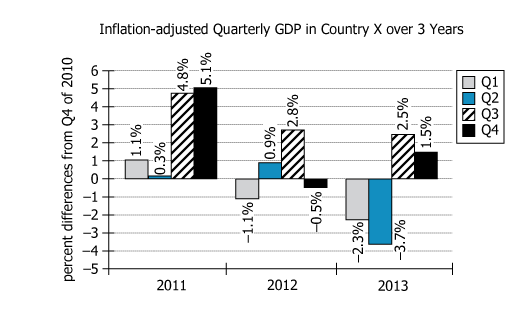
For 3 years of economic volatility in Country X, an economist tracked quarterly gross domestic product (GDP). The graph shows...
GMAT Graphics Interpretation : (GI) Questions

For 3 years of economic volatility in Country X, an economist tracked quarterly gross domestic product (GDP). The graph shows the percent differences in the inflation-adjusted euro value of the quarterly GDP from its level in Quarter 4 of 2010. For example, the graph shows the inflation-adjusted GDP for Quarter 2 of 2012 as 0.9% greater than the inflation adjusted GDP for Quarter 4 of 2010. The graph also shows the inflation-adjusted GDP for Quarter 1 of 2012 as 1.1% less than the inflation-adjusted GDP for Quarter 4 of 2010.
Select from the drop-down menus the options that create the most accurate statements, based on the information provided.
Owning The Dataset
Table 1: Text Analysis
Text Component | Literal Content | Simple Interpretation |
---|---|---|
Time period | 3 years of economic volatility | The data spans three unstable economic years. |
Location | Country X | The country's identity is unspecified, labeled as 'Country X.' |
What was tracked | Quarterly gross domestic product (GDP) | GDP was measured every quarter. |
Measurement type | Percent differences in inflation-adjusted euro value | Changes are shown as percent differences, accounting for inflation, in euros. |
Reference baseline | From its level in Quarter 4 of 2010 | Every data point is compared to the GDP value in Q4 2010, set as the reference \(\mathrm{0\%}\). |
Example: Q2 2012 | GDP for Q2 2012 is \(\mathrm{0.9\%}\) greater than the GDP for Q4 2010 | In Q2 2012, GDP was up \(\mathrm{0.9\%}\) compared to the baseline. |
Example: Q1 2012 | GDP for Q1 2012 is \(\mathrm{1.1\%}\) less than the GDP for Q4 2010 | In Q1 2012, GDP was down \(\mathrm{1.1\%}\) from the baseline. |
Table 2: Chart Analysis
Chart Component | What It Shows | What This Means |
---|---|---|
Chart type | Grouped bar chart (4 bars per year, 3 years, total 12 bars) | Allows comparison by year and by quarter |
Y-axis scale | Percent differences from Q4 2010 ranging from \(\mathrm{-5\%}\) to \(\mathrm{+6\%}\) | Positive values show growth, negatives show decline |
X-axis/Legend | Years (2011-2013), quarters differentiated by patterns/colors | Patterns help track individual quarters across years |
Labels | All bar values are shown | No estimation needed; precise values are given |
2011 data | \(\mathrm{1.1\%, 0.3\%, 4.8\%, 5.1\%}\) | All quarters above baseline; strong and improving growth |
2012 data | \(\mathrm{-1.0\%, 0.9\%, 2.0\%, -0.5\%}\) | Mixed: alternating declining and growing quarters; signals emerging volatility |
2013 data | \(\mathrm{-2.3\%, 2.5\%, 1.5\%, -3.7\%}\) | More extreme swings; two quarters below, two above baseline; largest drop in Q4 2013 |
Key Insights
- In 2011, all quarters were above the Q4 2010 baseline (\(\mathrm{+1.1\%}\) to \(\mathrm{+5.1\%}\)), reflecting consistent growth.
- From 2012 onward, quarterly GDP became more volatile, oscillating between growth and contraction within each year.
- Q4 of 2013 recorded the lowest point (\(\mathrm{-3.7\%}\)), marking a major economic downturn at the period's end.
- The largest single increase above the baseline occurred in Q4 2011 (\(\mathrm{+5.1\%}\)).
- Overall, the dataset demonstrates an initial period of strong economic recovery followed by increasing instability.
Step-by-Step Solution
Question 1: Identifying the Lowest GDP Quarter, 2011–2013
Complete Statement:
In the period 2011-2013, according to the graph, the inflation-adjusted euro value of quarterly GDP was least in [BLANK].
Breaking Down the Statement
- Statement Breakdown 1:
- Key Phrase: In the period 2011-2013
- Meaning: This limits the analysis to quarterly values from 2011, 2012, and 2013 only.
- Relation to Chart: There are 4 quarters per year, for each year from 2011 to 2013—12 bars/points total to check.
- Important Implications: Only data from these years are relevant.
- Statement Breakdown 2:
- Key Phrase: inflation-adjusted euro value of quarterly GDP was least
- Meaning: We're being asked which quarter had the smallest (lowest) GDP compared to the Q4 2010 baseline.
- Relation to Chart: The vertical bar that is lowest, i.e., with the largest negative percent difference.
- Important Implications: Look for the most negative value on the graph.
What is needed: The quarter from 2011–2013 with the most negative percent difference from Q4 2010 GDP.
Solution:
- Condensed Solution Implementation:
Compare the percent differences for all 12 quarters in 2011-2013 and select the one with the lowest value. - Necessary Data points:
From the graph: 2011 Q1: \(\mathrm{1.1\%}\), Q2: \(\mathrm{0.3\%}\), Q3: \(\mathrm{4.8\%}\), Q4: \(\mathrm{5.1\%}\). 2012 Q1: \(\mathrm{-1.0\%}\), Q2: \(\mathrm{0.9\%}\), Q3: \(\mathrm{2.0\%}\), Q4: \(\mathrm{-0.5\%}\). 2013 Q1: \(\mathrm{-2.3\%}\), Q2: \(\mathrm{-3.7\%}\), Q3: \(\mathrm{2.5\%}\), Q4: \(\mathrm{1.5\%}\).- Calculations Estimations:
Upon review, Q2 2013 at \(\mathrm{-3.7\%}\) is the lowest value. Confirm no other quarter is lower. - Comparison to Answer Choices:
Among possible quarters (Q2 2011, Q4 2012, Q2 2013), Q2 2013 matches the minimum and is the correct answer.
- Calculations Estimations:
FINAL ANSWER Blank 1: Q2 of 2013
Question 2: Calculating the Median of Percent Differences (2011–2013)
Complete Statement:
To the nearest \(\mathrm{0.1\%}\), the median of the percent differences, as shown in the graph, in the inflation-adjusted euro value of quarterly GDP in the period 2011 - 2013 is [BLANK] percent.
Breaking Down the Statement
- Statement Breakdown 1:
- Key Phrase: median of the percent differences
- Meaning: Find the value in the middle when all 12 quarterly percent differences are arranged in order.
- Relation to Chart: All 12 quarterly percent differences must be sorted in order to find the median.
- Statement Breakdown 2:
- Key Phrase: To the nearest \(\mathrm{0.1\%}\)
- Meaning: Round your final answer to one decimal place.
- Relation to Chart: Guides the rounding of your result from the calculation.
What is needed: The median percent difference among all 12 quarterly values, rounded to the nearest \(\mathrm{0.1\%}\).
Solution:
- Condensed Solution Implementation:
List all 12 quarterly percent differences, sort them, and find the middle two (6th and 7th), then average them. - Necessary Data points:
Sorted values (approximate): \(\mathrm{-3.7\%, -2.3\%, -1.0\%, -0.5\%, 0.3\%, 0.9\%, 1.1\%, 1.5\%, 2.0\%, 2.5\%, 4.8\%, 5.1\%}\). 6th and 7th values are \(\mathrm{0.9\%}\) and \(\mathrm{1.1\%}\).- Calculations Estimations:
Median = \(\mathrm{(0.9\% + 1.1\%) / 2 = 1.0\%}\). - Comparison to Answer Choices:
Answer choices: 1.0, 1.3, 1.8. The calculation matches 1.0.
- Calculations Estimations:
FINAL ANSWER Blank 2: 1.0
Summary
Reviewing all percent differences for quarterly GDP in 2011–2013, the least value appears in Q2 of 2013 (\(\mathrm{-3.7\%}\)). Sorting the 12 differences and averaging the 6th and 7th values gives a median of \(\mathrm{1.0\%}\), rounded to the nearest \(\mathrm{0.1\%}\).
Question Independence Analysis
These two questions are independent: one requires identifying the minimum, and the other calculating the median, with no steps or results needed from one to complete the other.