e-GMAT Logo
NEUR
N

During the last decade, the mean life expectancy in a certain country was a constant 75 years. In this country,...

GMAT Graphics Interpretation : (GI) Questions

Source: Official Guide
Graphics Interpretation
GI - Stats
EASY
...
...
Notes
Post a Query
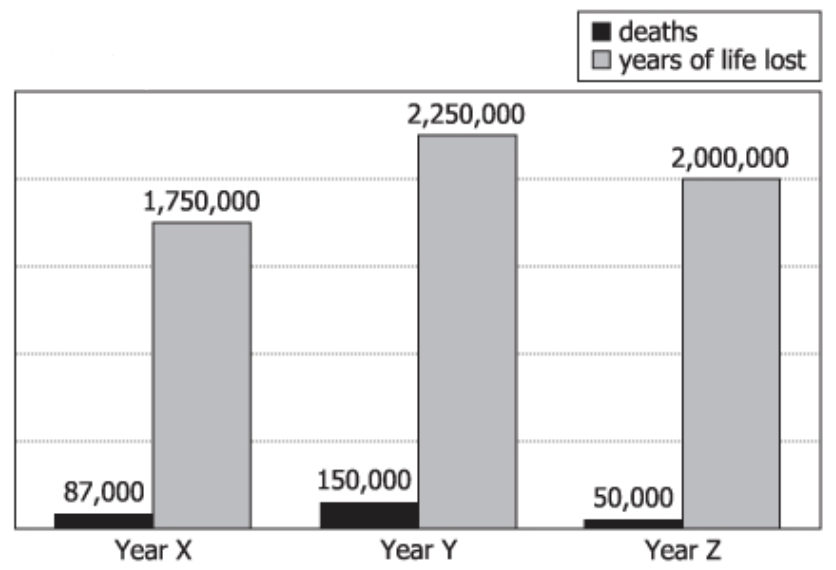
Mortality data graph showing deaths and years of life lost during epidemics in Years X, Y, and Z

During the last decade, the mean life expectancy in a certain country was a constant 75 years. In this country, epidemics occurred in Years X, Y, and Z of this period. The graph gives mortality data for each of the epidemics, showing both the numbers of deaths and the numbers of years of life lost as a result of those deaths.

In the following statements, which pertain only to Years X, Y, and Z, average refers to the arithmetic mean.

Use the drop-down menus to create the most accurate statements based on the information provided.

The year with the greatest number of deaths was
The year with the greatest average number of years of life lost per death was
Solution

Owning The Dataset

Table 1: Text Analysis

Text Analysis Table:

Text Segment Interpretation
"During the last decade, the mean life expectancy...75 years." Life expectancy was 75 years constantly over the decade.
"Epidemics occurred in Years X, Y, and Z of this period." Epidemics happened in three specific years, labeled X, Y, and Z.
"The graph gives mortality data...both numbers of deaths...years." A graph presents deaths and total years of life lost per epidemic
"Average refers to the arithmetic mean." Averages are to be calculated as simple arithmetic means.

Table 2: Chart Analysis

Chart Analysis Table:

Chart Element Details
Chart type Grouped bar chart showing two variables per year for years X, Y, and Z.
Variables shown For each year: number of deaths (black bar), years of life lost (gray bar).
Year X values Deaths: 87,000; Years lost: 1,750,000
Year Y values Deaths: 150,000; Years lost: 2,250,000
Year Z values Deaths: 50,000; Years lost: 2,000,000
Visual cues Year Y's deaths bar is tallest; Year Z's years lost is high relative to deaths.

Key Insights

  1. Year Y had the highest total deaths (150,000), easily seen from the tallest deaths bar.
  2. Year Z had the fewest deaths but nearly as many years lost as Year Y, implying younger victims.
  3. Average years of life lost per death: Year X \(\mathrm{\approx 20}\), Year Y \(\mathrm{\approx 15}\), Year Z \(\mathrm{\approx 40}\).
  4. The epidemics had different demographic impacts: Year Y killed more, but Year Z caused more years lost per death.

Step-by-Step Solution

Question 1: Year with the Greatest Number of Deaths

Complete Statement:

The year with the greatest number of deaths was [BLANK].

Breaking Down the Statement
  • Statement Breakdown 1:
    • Key Phrase: greatest number of deaths
      • Meaning: Determine which year had the highest total number of deaths.
      • Relation to Chart: Look at the death counts for each year as shown in the data or indicated on the bar chart.
      • Important Implications: This requires only a direct comparison of the totals—no calculations.
  • What is needed: Which year (X, Y, or Z) has the highest number of deaths.
Solution:
  • Condensed Solution Implementation:
    Compare the given death totals for each year to find the maximum.
  • Necessary Data points:
    Year X: 87,000 deaths; Year Y: 150,000 deaths; Year Z: 50,000 deaths.
    • Calculations Estimations:
      \(\mathrm{150,000\;(Y) \gt 87,000\;(X) \gt 50,000\;(Z)}\).
    • Comparison to Answer Choices:
      Year Y has the greatest number of deaths.
FINAL ANSWER Blank 1: Y

Question 2: Year with the Greatest Average Years of Life Lost per Death

Complete Statement:

The year with the greatest average number of years of life lost per death was [BLANK].

Breaking Down the Statement
  • Statement Breakdown 1:
    • Key Phrase: greatest average number of years of life lost per death
      • Meaning: Calculate the average years of life lost for each death, for each year.
      • Relation to Chart: Divide the total years of life lost by the total deaths for each year.
  • Statement Breakdown 2:
    • Key Phrase: greatest average
      • Meaning: The highest result after division indicates the answer.
      • Relation to Chart: Compare the computed averages among the three years.
  • What is needed: Which year (X, Y, or Z) has the highest average (ratio) of years lost per death.
Solution:
  • Condensed Solution Implementation:
    Divide total years of life lost by total deaths for each year, then compare.
  • Necessary Data points:
    Year X: \(\mathrm{1,750,000 \div 87,000}\); Year Y: \(\mathrm{2,250,000 \div 150,000}\); Year Z: \(\mathrm{2,000,000 \div 50,000}\).
    • Calculations Estimations:
      Year X: \(\mathrm{\approx 20.1}\) years per death; Year Y: 15 years per death; Year Z: 40 years per death.
    • Comparison to Answer Choices:
      Year Z has the greatest average years of life lost per death.
FINAL ANSWER Blank 2: Z

Summary

Year Y had the highest total deaths, but Year Z had a much higher average of years of life lost per death. This suggests Year Z's epidemic caused a heavier impact on younger individuals, while Year Y's epidemic affected more people overall.

Question Independence Analysis

Both questions are independent, as they use different metrics: the first simply compares total deaths while the second relies on calculating and comparing an average using both deaths and years lost. The answer to one does not determine the other.

Answer Choices Explained
The year with the greatest number of deaths was
1A
X
1B
Y
1C
Z
The year with the greatest average number of years of life lost per death was
2A
X
2B
Y
2C
Z
Rate this Solution
Tell us what you think about this solution
...
...
Forum Discussions
Start a new discussion
Post
Load More
Similar Questions
Finding similar questions...
Previous Attempts
Loading attempts...
Similar Questions
Finding similar questions...
Parallel Question Generator
Create AI-generated questions with similar patterns to master this question type.