Owning the Dataset
Table 1: Text Analysis
| Text Component |
Literal Content |
Interpretation |
| Chart Title |
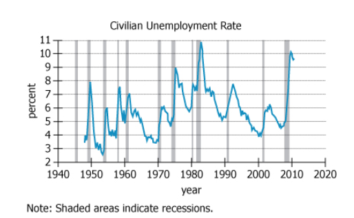
Civilian Unemployment Rate |
The chart shows the unemployment rate among U.S. civilians |
| Note |
Shaded areas indicate recessions |
Gray bars on the chart represent periods of economic recession |
| Y-axis Label |
percent |
Unemployment rate is measured as a percentage |
| X-axis Label |
year |
Data is shown yearly from 1940 to 2020 |
Table 2: Chart Analysis
| Chart Component |
Description |
Key Takeaway |
| Chart Type |
Single blue line, 1940-2020, grey bars for recessions |
Tracks unemployment over 80 years with recession markers |
| Unemployment Line |
Peaks and valleys, large fluctuations |
Unemployment rises and falls over different cycles |
| Recession Bars |
Several periods throughout the timeline |
Visual indicator of economic downturns |
| Peak Timing |
Unemployment peaks near end of recessions |
Highest unemployment matches the close of recessions |
| Recovery Slope |
Steep or gradual declines post-recession |
Some recoveries (late 1940s) faster than others (1990s) |
Key Insights
Unemployment rate peaks consistently occur at or near the end of recession periods, not at their start or midpoint. The pattern of post-recession recovery varies significantly across different time periods, with some showing steep drops in unemployment (late 1940s) and others showing more gradual improvement (early 1990s). This indicates that unemployment is a lagging indicator of economic cycles, often remaining elevated as the economy enters recovery.
Step-by-Step Solution
Question 1: Timing of Unemployment Peaks During Recessions
Complete Statement:
Based on the information in the graph, peaks in civilian unemployment rates occurred nearest the [BLANK] of a recession.
Breaking Down the Statement
- Statement Breakdown 1:
- Key Phrase: peaks in civilian unemployment rates
- Meaning: This refers to the highest points on the unemployment line during each cycle.
- Relation to Chart: These are the local maximum points on the chart's unemployment rate line, which should be compared to the shaded recession bars.
- Important Implications: We need to determine their timing relative to the beginning, middle, or end of the recession periods marked by shaded bars.
- Statement Breakdown 2:
- Key Phrase: nearest the [BLANK] of a recession
- Meaning: Specifies a comparison to a section of the recession (beginning, middle, end).
- Relation to Chart: The shaded bars mark recessions, so we must check if peaks tend to fall at the start, midpoint, or end of these bars.
- Important Implications: This narrows our focus to temporal placement of peaks and helps eliminate distractor answer choices.
- What is needed: Whether unemployment peaks most often near the start, middle, or end of a recession period.
Solution:
- Condensed Solution Implementation:
Visually examine several recessions and note where the unemployment rate peaks relative to the shaded bars. Check if the highest points are at the beginning, middle, or end of the recessions.
- Necessary Data points:
Locations of unemployment rate peaks in relation to the shaded (recession) bars on the chart.
- Calculations Estimations:
Observing the trends shows that unemployment typically peaks right at or just after the end of each shaded bar.
- Comparison to Answer Choices:
The 'end' option fits best, as peaks are not found at the start or in the middle of the shaded bars.
FINAL ANSWER Blank 1: End
Question 2: Comparison of Post-Recession Unemployment Rate Change
Complete Statement:
Based on the information in the graph, the period immediately following the recession ending in the late 1940s, compared with the period immediately following the recession ending in the early 1990s, was characterized by [BLANK] in civilian unemployment rates.
Breaking Down the Statement
- Statement Breakdown 1:
- Key Phrase: period immediately following the recession ending in the late 1940s
- Meaning: The time right after the gray shaded bar that ends in the late 1940s.
- Relation to Chart: Find the end of the shaded bar in the late 1940s, then look at how the unemployment rate changes.
- Statement Breakdown 2:
- Key Phrase: compared with the period immediately following the recession ending in the early 1990s
- Meaning: Compare this to the time just after the shaded bar in the early 1990s.
- Relation to Chart: Find the end of the recession in the early 1990s and look at the change in the unemployment rate following that.
- What is needed: Whether the rate of decline in unemployment after the late 1940s recession was steeper, less steep, or similar compared to after the early 1990s recession.
Solution:
- Condensed Solution Implementation:
Compare visually the drop in unemployment rate after each recession by examining the slope of the line following the end of each shaded bar.
- Necessary Data points:
The slope of the unemployment rate immediately after the late 1940s recession (sharp drop) and after the early 1990s recession (slow/gradual drop).
- Calculations Estimations:
After the late 1940s, the unemployment rate drops quickly from about 7-8% to around 4% within a year or so. After the early 1990s, the decline is much slower and more gradual.
- Comparison to Answer Choices:
A 'steep decrease' is seen after the late 1940s recession, while the early 1990s show a gradual decline. 'Steep decrease' is the most accurate choice.
FINAL ANSWER Blank 2: a steep decrease
Summary
Both questions are answered by visually analyzing the relative position and slope of the unemployment rate line compared to shaded recession bars. Unemployment rate peaks come at the end of recessions, and the post-recession decline in the late 1940s was significantly steeper than after the early 1990s.
Question Independence Analysis
The questions are independent. Question 1 asks about the general timing of unemployment peaks during recessions, while Question 2 is a comparison of recovery periods after two specific recessions. Answering one does not rely on the answer to the other.
