Based on a study of a 10,000 person sample of the adult population of Country Y, the unbroken curve on...
GMAT Graphics Interpretation : (GI) Questions

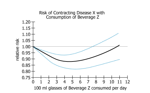
Based on a study of a 10,000 person sample of the adult population of Country Y, the unbroken curve on the graph plots an association between daily consumption of various amounts of Beverage Z and the relative risk of contracting Disease X compared to the risk with no consumption of Beverage Z (indicated by 1.00). For the entire adult population of Country Y, the relative-risk values could—because of sampling error—be either higher or lower than for the particular 10,000 person sample studied. Thus the two broken lines show the estimates of how high or how low those relative-risk values for that population could be.
From the drop-down menus, select the options that create the statement that is most strongly supported by the information provided.
Owning the Dataset
Table 1: Text Analysis
Text Component | Literal Content | Simple Interpretation |
---|---|---|
Study Sample | "10,000 person sample of the adult population of Country Y" | Study examines 10,000 adults from Country Y. |
Measurement | "association between daily consumption of various amounts of Beverage Z and the relative risk of contracting Disease X" | How drinking different amounts of Beverage Z affects risk of Disease X. |
Baseline | "no consumption of Beverage Z (indicated by 1.00)" | Baseline risk (1.00) is for those who don't drink Beverage Z. |
Solid Line | "unbroken curve on the graph plots an association..." | Solid curve shows relative risk for different consumption levels in the sample. |
Statistical Variation | "relative-risk values could—because of sampling error—be either higher or lower..." | Results may be slightly higher or lower for the whole population due to sampling. |
Confidence Bounds | "two broken lines show the estimates of how high or how low those relative-risk values...could be" | Broken/dotted lines show statistical range of possible population risk estimates. |
Table 2: Chart Analysis
Chart Component | What's Shown | Interpretation |
---|---|---|
Type | Single-panel line chart, three lines | Shows main sample result and its uncertainty |
X-axis | 100 ml glasses of Beverage Z per day (0–12) | Range of daily Beverage Z consumption levels |
Y-axis | Relative risk (0.75–1.20), with reference line at y=1.00 | y<1.00: less risk than baseline; y>1.00: more risk |
Solid black line | U-shaped curve, lowest point at 4–6 glasses | Moderate consumption (4–6 glasses) linked to lowest risk |
Dotted blue lines | Upper/lower 95% confidence intervals, follow same U-shape | Shows uncertainty; pattern is reliable |
Trend | Risk falls with moderate consumption, returns to baseline at higher | Too much or too little Beverage Z less protective; moderate is optimal |
Key Insights
- The lowest relative risk of Disease X occurs at moderate Beverage Z consumption (4–6 glasses daily), indicating a U-shaped relationship.
- Drinking more than 6 glasses causes risk to rise back toward baseline; high consumption loses protective effect.
- Confidence intervals closely follow the main trend, supporting the robustness of the U-shaped association.
- Occasional or very high consumption offers little or no risk reduction.
- The optimal protective range is moderate, not maximum, consumption.
Step-by-Step Solution
Question 1: Determining the Magnitude of Risk Reduction
Complete Statement:
Compared to the risk with no consumption of Beverage Z, the reduction in relative risk of contracting Disease X for adults of Country Y is [BLANK 1]
Breaking Down the Statement
- Statement Breakdown 1:
- Key Phrase: Compared to the risk with no consumption of Beverage Z
- Meaning: We are looking at changes in risk relative to people who do not drink Beverage Z at all.
- Relation to Chart: The starting point at 0 glasses/day on the X-axis, where relative risk is set to 1.00.
- Important Implications: All other data points (where consumption > 0) are being measured relative to this risk level.
- Statement Breakdown 2:
- Key Phrase: the reduction in relative risk
- Meaning: Identifying how much the risk decreases below the baseline.
- Relation to Chart: This is visualized by how far below 1.00 the curve dips.
- Important Implications: The 'greatest' reduction is the lowest point of the curve.
- What is needed: We need to determine at which point the reduction in relative risk (how much lower risk gets compared to 0 glasses/day) is greatest.
Solution:
- Condensed Solution Implementation:
Look for the lowest point on the U-shaped curve, which is the point of greatest reduction compared to risk at 0 glasses. - Necessary Data points:
Risk at 0 glasses is set at 1.00; the curve drops below 1.00, reaches a minimum, then rises again.- Calculations Estimations:
Visually, the minimum is evident in the U-shaped curve - no complex calculations needed. - Comparison to Answer Choices:
At the curve's lowest point, the reduction is 'greatest'; elsewhere, the reduction is 'less', and at 0 glasses it's 'unchanged'.
- Calculations Estimations:
FINAL ANSWER Blank 1: Greatest
Question 2: Identifying the Consumption Range for Greatest Reduction
Complete Statement:
when the daily consumption of Beverage Z is in the range of [BLANK 2] 100 mg glasses
Breaking Down the Statement
- Statement Breakdown 1:
- Key Phrase: when the daily consumption ... is in the range of
- Meaning: Identifying which range of Beverage Z consumption gives the greatest reduction in risk.
- Relation to Chart: Relates to the X-axis (number of glasses/day).
- Statement Breakdown 2:
- Key Phrase: 100 mg glasses
- Meaning: Specifies the unit of Beverage Z measured per day.
- Relation to Chart: X-axis labels represent glasses/day in this unit.
- What is needed: The range of daily glasses that corresponds to the lowest point (greatest reduction) on the risk curve.
Solution:
- Condensed Solution Implementation:
Locate the X-axis section where the curve is at its minimum. - Necessary Data points:
From the chart, the minimum of the U-shaped curve falls within the 4-6 glasses/day interval.- Calculations Estimations:
No math needed—direct visual matching of minimum to interval labels. - Comparison to Answer Choices:
1-3: curve is descending, not minimum; 4-6: curve minimum; above 6: curve is ascending again.
- Calculations Estimations:
FINAL ANSWER Blank 2: 4-6
Summary
Greatest risk reduction is observed at the lowest point of the U-shaped curve, which occurs when consuming 4-6 glasses of Beverage Z daily. This suggests that moderate intake provides optimal benefit, while both lower and higher amounts provide less reduction in risk.
Question Independence Analysis
Blank 1 and Blank 2 are dependent. To answer Blank 2, you must first understand where the greatest risk reduction occurs, as established in Blank 1.