e-GMAT Logo
NEUR
N

At the end of each year, the Harcar Corporation assigns a rating to each member of its sales staff. The...

GMAT Graphics Interpretation : (GI) Questions

Source: Mock
Graphics Interpretation
GI - Stats
HARD
...
...
Notes
Post a Query
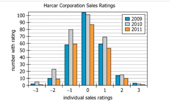
Graph showing sales staff ratings for years 2009, 2010, and 2011

At the end of each year, the Harcar Corporation assigns a rating to each member of its sales staff. The sales ratings are based on the mean (μ) and standard deviation (σ) for the individual sales totals for the year. The rating is computed by applying the following formula and then rounding the result to the nearest integer.

\(\text{Individual rating} = \frac{\text{individual total} - \mu}{\sigma}\)

Sales staff are considered for promotion if their rating is 3. The graph shows the ratings for the entire sales staff for the years 2009, 2010, and 2011.


Sales staff are considered for promotion if their rating is 3. The graph shows the ratings for the entire sales staff for the years 2009, 2010, and 2011.

1. The graphthe claim that the sales staff had the fewest members in 2010.
2. The graphthe claim that, as a group, the staff's total sales were highest in 2011.
Solution

Owning the Dataset

Table 1: Text Analysis

Text Component Literal Content Simple Interpretation
Company & Process At the end of each year, the Harcar Corporation assigns a rating to each member of its sales staff. Yearly performance ratings for all salespeople are assigned by the company.
Rating Basis The sales ratings are based on the mean (\(\mu\)) and standard deviation (\(\sigma\)) for the individual sales totals for the year. Ratings reflect how each sales total compares to the average and spread for that year.
Rating Formula Individual rating = \(\frac{\text{individual total} - \mu}{\sigma}\), rounded to the nearest integer. Each person's rating measures their performance in standard deviations from the mean.
Promotion Criterion Sales staff are considered for promotion if their rating is 3. Only employees at least 3 SD above average are eligible for promotion.
Years Shown The graph shows the ratings for the entire sales staff for the years 2009, 2010, and 2011. The diagram covers employee ratings distributions for three consecutive years.

Table 2: Chart Analysis

Chart Component What Is Shown Interpretation
Chart Type Grouped bar chart (one group each for 2009, 2010, 2011) Compares distributions across three years
X-axis Ratings from -3 to 3 Range: far below average to far above average
Y-axis Number of employees (0-100) Measures how many staff received each rating
Distribution Shape Bell curve, peak at 0 Most staff are average performers
Count at 0 104 (2009), 101 (2010), 86 (2011) Plurality of staff are rated average each year
Counts at 3 3 (2009), 2 (2010), 1 (2011) Very few achieve promotion threshold
Total Staff 251 (2009), 296 (2010), 219 (2011) 2010: largest group; 2011: smallest

Key Insights

  1. The rating distributions are consistent bell curves centered at 0 each year, indicating that staff performance is generally stable and most employees perform near the average.
  2. Only a tiny fraction of staff meet the high-bar promotion criterion (rating of 3): 3 in 2009, 2 in 2010, and 1 in 2011.
  3. 2010 had the largest sales staff, while 2011 had the smallest; staff counts shift somewhat but the shape of the ratings distribution remains stable.
  4. Because the ratings are standardized each year, you cannot determine from this data alone which year had the highest total sales—only relative performance within each year.

Step-by-Step Solution

Question 1: Staff Headcount in 2010

Complete Statement:

The graph [BLANK] the claim that the sales staff had the fewest members in 2010.

Breaking Down the Statement
  • Statement Breakdown 1:
    • Key Phrase: the sales staff had the fewest members in 2010
      • Meaning: The statement is claiming that, of all years shown (2009, 2010, 2011), 2010 is the year with the smallest number of sales staff.
      • Relation to Chart: The chart displays the distribution of sales staff for each year across z-score ratings categories; by adding up the height of bars for each year, we get the total staff count for that year.
      • Important Implications: If the bars for 2010 are taller (sum to a greater total) than other years, then this claim is not true.
  • Statement Breakdown 2:
    • Key Phrase: The graph [BLANK] the claim
      • Meaning: "[Blank]" here means whether the graph supports, refutes, or neither supports nor refutes the claim.
      • Relation to Chart: We look at the bar heights in the graph to judge if the claim is supported, refuted, or not answered by the graphic.
      • Important Implications: The correct answer depends only on what can be observed on the chart about the total staff in each year.
  • What is needed: Does the chart show that 2010 had the fewest staff among the three years, or not?
Solution:
  • Condensed Solution Implementation:
    Add up all the bars (categories) for each year to see which year has the fewest total staff.
  • Necessary Data points:
    Total number of staff in each year as illustrated by the sum of the bar heights: 2009 (251), 2010 (296), 2011 (219).
    • Calculations Estimations:
      Visually, the bars for 2010 are generally taller and sum to a larger total than the bars for 2009 or 2011. Specifically, 2010 has the highest count, not the fewest.
    • Comparison to Answer Choices:
      Since 2010 had the MOST staff, the graph clearly refutes the claim that 2010 had the fewest staff.
FINAL ANSWER Blank 1: Refutes

Question 2: Total Sales in 2011

Complete Statement:

The graph [BLANK] the claim that, as a group, the staff's total sales were highest in 2011.

Breaking Down the Statement
  • Statement Breakdown 1:
    • Key Phrase: the staff's total sales were highest in 2011
      • Meaning: The claim is that, when you add up all the sales for all staff in each year, 2011 has the largest sum.
      • Relation to Chart: The chart shows the distribution of standardized sales ratings (z-scores) for each year, not actual total sales values.
  • Statement Breakdown 2:
    • Key Phrase: The graph [BLANK] the claim
      • Meaning: "[Blank]" asks whether the chart gives evidence for or against this claim about highest total sales in 2011.
      • Relation to Chart: Since the ratings are standardized inside each year, the actual total sales for each year are not shown in the graph.
  • What is needed: Can standardized (z-score) sales ratings reveal which year had the highest total sales?
Solution:
  • Condensed Solution Implementation:
    Recognize that z-score ratings do not provide information about total (absolute) sales. Standardization resets the mean each year, so the graph only tells us about relative performance within a year.
  • Necessary Data points:
    The ratings shown are calculated via \(z = \frac{\text{individual sales} - \text{year mean sales}}{\text{year standard deviation}}\). Means and actual sales totals are absent.
    • Calculations Estimations:
      Because we don't know the mean or sum of actual sales in any year, we cannot assess if 2011's total is higher or lower than in other years.
    • Comparison to Answer Choices:
      The graph neither supports nor refutes the claim, because it lacks the information needed to compare total sales across years.
FINAL ANSWER Blank 2: Neither supports nor refutes

Summary

The graph allows us to determine total staff each year (from bar heights), showing 2010 had the most and 2011 the fewest staff, refuting the claim in Question 1. However, because the data are standardized within each year, the chart gives absolutely no information about actual sales figures, so it cannot support or refute claims about which year had the highest total sales, as in Question 2.

Question Independence Analysis

The two questions are independent because Question 1 is about staff headcount (which is encoded in the sum of the bar heights for each year), while Question 2 is about total sales (which the chart does not display at all, as it only shows standardized scores). The answer to one does not affect the reasoning or answer to the other.

Answer Choices Explained
1. The graph
1A
Supports
1B
Refutes
1C
Nor supports neither refute
the claim that the sales staff had the fewest members in 2010.
2. The graph
2A
Supports
2B
Refutes
2C
Nor supports neither refute
the claim that, as a group, the staff's total sales were highest in 2011.
Rate this Solution
Tell us what you think about this solution
...
...
Forum Discussions
Start a new discussion
Post
Load More
Similar Questions
Finding similar questions...
Previous Attempts
Loading attempts...
Similar Questions
Finding similar questions...
Parallel Question Generator
Create AI-generated questions with similar patterns to master this question type.