e-GMAT Logo
NEUR
N

As of the beginning of June 2012 (6/12), Device D (an Internet-connected device) was available in exactly 5 versions. Version...

GMAT Graphics Interpretation : (GI) Questions

Source: Official Guide
Graphics Interpretation
GI - Stats
HARD
...
...
Notes
Post a Query
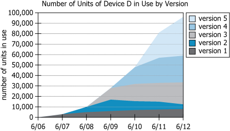
Graph showing Device D usage by version from 2006-2012

As of the beginning of June 2012 (6/12), Device D (an Internet-connected device) was available in exactly 5 versions. Version 1 became available at the beginning of June 2006 (6/06), and a new version became available at the beginning of each subsequent June, with Version 5 becoming available at the beginning of June 2010 (6/10). The graph shows the number of units of Device D in use, by version, at the beginning of each June from 2006 through 2012. For example, at the beginning of June 2008 (6/08), there were approximately 10,000 units of Device D in use, approximately 5,000 of which were Version 1 and approximately 5,000 of which were Version 2.


Based on the information above, select from each drop-down menu the option that completes the statement most accurately.

During the first calendar year throughout which the graph suggests a decrease over time in the number of devices in use of Version, Versionbecame available.
Solution

Owning The Dataset

Table 1: Text Analysis

Text Component Literal Content Simple Interpretation
Device Description Device D (an Internet-connected device) Device D is an internet-connected technology
Version Count Exactly 5 versions as of June 2012 There are five versions in total
Release Timeline Version 1: June 2006; then new version each June, up to Version 5 in June 2010 One new version annually from 2006 to 2010
Data Range Graph shows units in use per version at each June from 2006 through 2012 Data covers unit usage by version at yearly intervals for 7 years
Example Data Point June 2008: ~10,000 units (about 5,000 each of Version 1 and Version 2) In June 2008, both V1 and V2 each had ~5,000 units in use

Table 2: Chart Analysis

Chart Element Shown Details Implications/Findings
Chart Type Stacked area chart with 5 colored areas (1 per version) Visually compares simultaneous version adoption
X-Axis Years: 6/06, 6/07, 6/08, 6/09, 6/10, 6/11, 6/12 Covers 7 consecutive years annually
Y-Axis Units in use (scale: 0–100,000, intervals of 10,000) Shows steady increase in total device adoption
Stacking Order Version 1 on bottom, Version 5 on top Older versions phase out as newer gain traction
Version Patterns Each colored area grows then tapers as next version enters Reveals when users migrate to newer versions

Key Insights

Device D experienced strong growth, reaching almost 100,000 active units by 2012. With annual launches, each new version quickly overtook the previous one, shown by version areas crossing and earlier versions tapering off as new ones appear. The example from June 2008 illustrates a near-equilibrium point for Versions 1 and 2. This dataset displays a classic lifecycle pattern: customer adoption shifts neatly to newer versions soon after each release, and overall usage increases rapidly over time, signaling both effective versioning strategy and growing popularity.

Step-by-Step Solution

Question 1: Identifying the Version That First Declines When a New Version Appears

Complete Statement:

During the first calendar year throughout which the graph suggests a decrease over time in the number of devices in use of Version [BLANK 1], Version [BLANK 2] became available.

Breaking Down the Statement
  • Statement Breakdown 1:
    • Key Phrase: first calendar year
      • Meaning: The very first January-to-December period in which the condition occurs.
      • Relation to Chart: Check version usage from January to December in consecutive years on the chart.
      • Important Implications: Must identify the earliest year with a decrease for any version.
  • Statement Breakdown 2:
    • Key Phrase: graph suggests a decrease over time in the number of devices in use
      • Meaning: Looking for a decline (downward trend) in how many devices use a given version during a calendar year.
      • Relation to Chart: Visually, a band for that version narrows between two points.
      • Important Implications: Decline must be clear and span the calendar year.
  • What is needed: Which version (1, 2, 3, or 4) first showed a decrease in a calendar year coinciding with the release of a new version?
Solution:
  • Condensed Solution Implementation:
    Analyze each version in chronological order, find the first year its use drops, and check if a new version is also released then.
  • Necessary Data points:
    Year-over-year usage for versions 1-4; release dates: V1 (June 2006), V2 (June 2007), V3 (June 2008), V4 (June 2009), V5 (June 2010).
    • Calculations Estimations:
      Version 2's usage first drops during the 2009-2010 year. In that same calendar year, Version 5 launches (June 2010). Version 1's drop occurs earlier but does not coincide with a new launch; Version 3 and 4 drop in later periods, not with new launches.
    • Comparison to Answer Choices:
      Among 1-4, only Version 2's first decrease overlaps with the release of a new version (Version 5).
FINAL ANSWER Blank 1: 2

Question 2: Identifying the Version That Became Available During the Decline

Complete Statement:

During the first calendar year throughout which the graph suggests a decrease over time in the number of devices in use of Version 2, Version [BLANK 2] became available.

Breaking Down the Statement
  • Statement Breakdown 1:
    • Key Phrase: During the first calendar year throughout which ... decrease ... of Version 2
      • Meaning: In the same year Version 2's numbers first fall.
      • Relation to Chart: Pinpoint 2009-2010 as Version 2's first decline period.
  • Statement Breakdown 2:
    • Key Phrase: Version [BLANK 2] became available
      • Meaning: Determine which version was released during this period.
      • Relation to Chart: Match release dates to this year.
  • What is needed: Which version launched during the calendar year while Version 2's usage first declined?
Solution:
  • Condensed Solution Implementation:
    Cross-reference first decline of Version 2 (2009-2010) with the release schedule.
  • Necessary Data points:
    Version 2 drops in 2009-2010. Version 5 launches in June 2010; other versions launch earlier.
    • Calculations Estimations:
      The only version introduced during 2009-2010 is Version 5.
    • Comparison to Answer Choices:
      Among choices, Version 5 matches this criterion.
FINAL ANSWER Blank 2: 5

Summary

Version 2 showed its first calendar-year decrease in use during 2009-2010, coinciding with the launch of Version 5. This demonstrates that the introduction of a new version can result in decreased usage of older versions, as seen in the release and decline pattern on the chart.

Question Independence Analysis

The questions are dependent: the answer to Question 2 relies on the version identified in Question 1, since the version that becomes available is tied to when the earlier version first declines.

Answer Choices Explained
During the first calendar year throughout which the graph suggests a decrease over time in the number of devices in use of Version
1A
1
1B
2
1C
3
1D
4
, Version
2A
2
2B
3
2C
4
2D
5
became available.
Rate this Solution
Tell us what you think about this solution
...
...
Forum Discussions
Start a new discussion
Post
Load More
Similar Questions
Finding similar questions...
Previous Attempts
Loading attempts...
Similar Questions
Finding similar questions...
Parallel Question Generator
Create AI-generated questions with similar patterns to master this question type.