e-GMAT Logo
NEUR
N

An international health organization collected global data regarding a certain disease for each of 14 consecutive years (Y1 – Y14)....

GMAT Graphics Interpretation : (GI) Questions

Source: Official Guide
Graphics Interpretation
GI - Other
MEDIUM
...
...
Notes
Post a Query
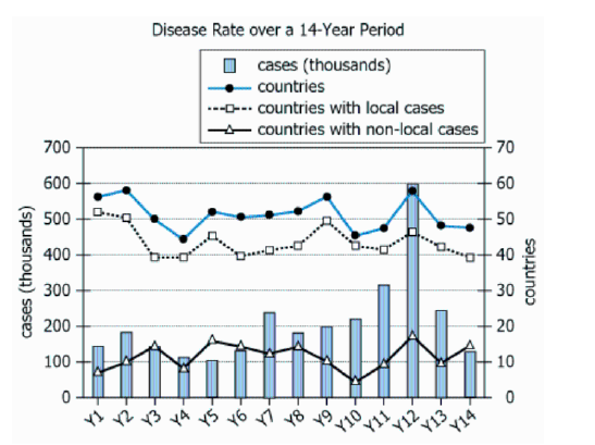
Graph showing annual disease data over 14 consecutive years

An international health organization collected global data regarding a certain disease for each of 14 consecutive years (Y1 – Y14). The graph shows the annual numbers of cases, countries, countries with local cases (i.e., cases for which the infection was contracted within the country), and countries with non-local cases (i.e., cases for which the infection was contracted outside of the country).

From each drop-down menu, select the option that creates the most accurate statement according to the information provided.

The percent increase in the number of cases of the disease from Y9 to Y12 was, to the nearest 10%,.
The average (arithmetic mean) of the numbers of countries with local cases from Y1 to Y5 was, to the nearest 5 countries,.
Solution

Owning the Dataset

Table 1: Text Analysis

Text Component Literal Content Interpretation
Data Collector An international health organization Reputable, global data source
Subject Collected global data regarding a certain disease Study focuses on one disease, not named
Time Frame Each of 14 consecutive years \(\mathrm{(Y1–Y14)}\) Annual data, labeled Y1 to Y14, over 14 years
Annual Cases Annual numbers of cases Total number of disease cases reported each year
Countries Annual numbers of countries How many countries reported disease occurrence annually
Local Cases Countries with local cases (infection contracted within the country) Countries with in-country transmission
Non-local Cases Countries with non-local cases (infection contracted outside the country) Countries with travel/imported cases

Table 2: Chart/Graph Analysis

Chart Element What it Shows Interpretation
Chart Type Combination bar and line chart, dual Y-axes Multiple data types visualized; direct time series comparison
X-Axis Years \(\mathrm{Y1−Y14}\) 14-year timeline, aligns with text description
Left Y-Axis \(\mathrm{0–700}\) (in thousands, for cases) Disease case counts (e.g., up to 600,000)
Right Y-Axis \(\mathrm{0–70}\) (for countries) Number of affected countries (max observed ≈ 59)
Blue Bars Case numbers per year Visualizes fluctuations, particularly a major spike in Y12
Solid Line Total countries affected each year Shows stable range (about 45–59 countries/year)
Dashed Line Countries with local cases per year Usually just below total countries; most cases are local
Y12 Spike Large increase in blue bar Dramatic uptick in cases without rise in affected countries

Key Insights

  • The number of disease cases fluctuates dramatically, particularly with a sharp spike in year Y12 (from ~200,000 to ~600,000 cases), while the number of affected countries remains largely stable.
  • A consistently small gap between total countries and countries with local cases suggests most transmission occurs within national borders, not via international travel.
  • Despite intense outbreaks (as in Y12), geographic spread remains contained: the disease intensifies in certain locations but does not expand to many more countries.
  • The early years (Y1–Y5) feature slowly declining cases and nearly stable country counts, indicating a baseline before later outbreaks.

Step-by-Step Solution

Question 1: Percent Increase in Cases from Y9 to Y12

Complete Statement:

The percent increase in the number of cases of the disease from Y9 to Y12 was, to the nearest 10%, ______.

Breaking Down the Statement
  • Statement Breakdown 1:
    • Key Phrase: percent increase
    • Meaning: The amount by which something grows, shown as a percentage compared to its starting value.
    • Relation to Chart: Compare the height of the bars for Y9 and Y12, since those represent cases for those years.
    • Important Implications: Requires the formula: \(\frac{\mathrm{final - initial}}{\mathrm{initial}} \times 100\%\).
  • Statement Breakdown 2:
    • Key Phrase: from Y9 to Y12
    • Meaning: The starting year is Y9, and the ending year is Y12.
    • Relation to Chart: Locate Y9 and Y12 along the x-axis and use their respective bar heights.
    • Important Implications: It's important to use only those two years' data and ignore any in between.

What is needed: The percentage increase in disease cases from Y9 to Y12, rounded to the nearest 10%.

Solution:
  • Condensed Solution Implementation:
    Use the bar values for Y9 and Y12 and apply the percent increase formula.
  • Necessary Data points:
    Cases in Y9: 200,000; Cases in Y12: 600,000.
  • Calculations Estimations:
    Percent increase = \(\frac{600,000 - 200,000}{200,000} \times 100\% = \frac{400,000}{200,000} \times 100\% = 2 \times 100\% = 200\%\).
  • Comparison to Answer Choices:
    200% is one of the available answer choices and matches exactly.
FINAL ANSWER Blank 1: 200%

Question 2: Average Countries with Local Cases from Y1 to Y5

Complete Statement:

The average (arithmetic mean) of the numbers of countries with local cases from Y1 to Y5 was, to the nearest 5 countries, ______.

Breaking Down the Statement
  • Statement Breakdown 1:
    • Key Phrase: average (arithmetic mean)
    • Meaning: Sum all values, then divide by count to get the mean.
    • Relation to Chart: Extract numbers for Y1 through Y5 from the dashed line (countries with local cases).
  • Statement Breakdown 2:
    • Key Phrase: countries with local cases
    • Meaning: The count of countries where the disease originated locally (not imported).
    • Relation to Chart: These are represented by the dashed line on the graph.

What is needed: The mean (rounded to the nearest 5) of local-cases countries from Y1 to Y5.

Solution:
  • Condensed Solution Implementation:
    Read the dashed line values for Y1-Y5, sum them, divide by 5, and round to the closest 5.
  • Necessary Data points:
    Y1: 51, Y2: 50, Y3: 40, Y4: 40, Y5: 46 countries.
  • Calculations Estimations:
    Sum = 51 + 50 + 40 + 40 + 46 = 227. Average = \(227 \div 5 = 45.4\). Rounded to nearest 5 = 45.
  • Comparison to Answer Choices:
    Answer choices are 15, 35, 45, and 55. 45 matches our result and is between the values given.
FINAL ANSWER Blank 2: 45

Summary

For blank 1, a direct application of the percent increase formula shows cases tripled from Y9 to Y12, resulting in a 200% increase. For blank 2, averaging the first five dashed line values and rounding gives 45 countries. Both use distinct data and math.

Question Independence Analysis

The questions are independent. Blank 1 uses bar graph values (cases) and years 9 and 12, while blank 2 uses dashed line values (countries) and years 1 through 5. Solving one does not assist with the other.

Answer Choices Explained
The percent increase in the number of cases of the disease from Y9 to Y12 was, to the nearest 10%,
1A
30%
1B
50%
1C
100%
1D
200%
.
The average (arithmetic mean) of the numbers of countries with local cases from Y1 to Y5 was, to the nearest 5 countries,
2A
15
2B
35
2C
45
2D
55
.
Rate this Solution
Tell us what you think about this solution
...
...
Forum Discussions
Start a new discussion
Post
Load More
Similar Questions
Finding similar questions...
Previous Attempts
Loading attempts...
Similar Questions
Finding similar questions...
Parallel Question Generator
Create AI-generated questions with similar patterns to master this question type.