e-GMAT Logo
NEUR
N

A significant number of people surveyed in the most recent census had migrated, that is, they had a different physical...

GMAT Graphics Interpretation : (GI) Questions

Source: Official Guide
Graphics Interpretation
GI - Other
EASY
...
...
Notes
Post a Query
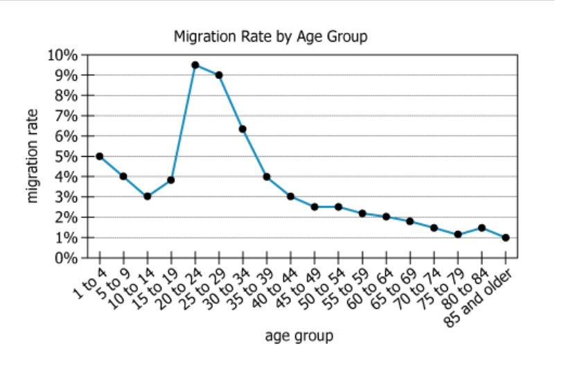
Graph showing migration rates by age group from census data

A significant number of people surveyed in the most recent census had migrated, that is, they had a different physical address in that census compared to the prior one. The migration rate is the percentage of an entire population that has migrated. For each age group, the graph shows the migration rate in the most recent census.


From each drop-down menu, select the option that creates the most accurate statement based on the information given.

A. Among the age groups along the horizontal axis of the graph, the range of the migration rates is, to the nearest half percent,
B. Between any two consecutive age groups along the horizontal axis, the greatest difference in migration rates is, to the nearest half percent,%
Solution

Owning the Dataset

Table 1: Text Analysis

Text Component Literal Content Simple Interpretation
Subject A significant number of people surveyed in the most recent census had migrated The dataset is about people who changed where they live, according to census data
Definition (Migration) Had a different physical address in that census compared to the prior one Migration means living in a new place compared to the previous census
Definition (Migration rate) The percentage of an entire population that has migrated The migration rate is what percent of people moved
Data Displayed For each age group, the graph shows the migration rate in the most recent census The migration rate is broken down by age group as shown in the chart

Table 2: Chart Analysis

Chart Component Description Main Takeaway
Chart Type Single line chart with 17 age group points Trend over age, compares migration for each group
X-axis Age groups from '1 to 4' up to '85 and older' (in 5-year increments) Migration is measured for all ages
Y-axis Migration rate (%), scale from 0% to 10% Migration is less than 10% for all groups
Highest Value \(\mathrm{9.5\%}\) at age 20-24 Young adults move most often
Largest Change From \(\mathrm{3.9\%}\) (15-19) to \(\mathrm{9.5\%}\) (20-24), a 5.6 percentage point jump Biggest increase occurs at early adulthood
Overall Trend Rates fall steadily after age 30, down to \(\mathrm{1.0\%}\) for 85+ Older people move less frequently

Key Insights

  1. The migration rate peaks sharply at \(\mathrm{9.5\%}\) for people aged 20-24, much higher than any other age group.
  2. The largest consecutive increase in migration rate is a jump of 5.6 percentage points between ages 15-19 and 20-24.
  3. After age 30, the migration rate steadily declines, bottoming out at \(\mathrm{1.0\%}\) for people 85 and older.

Step-by-Step Solution

Question 1: Finding the Range of Migration Rates

Complete Statement:

Among the age groups along the horizontal axis of the graph, the range of the migration rates is, to the nearest half percent, ______.

Breaking Down the Statement
  • Statement Breakdown 1:
    • Key Phrase: Among the age groups along the horizontal axis
    • Meaning: Consider all available age groups shown on the x-axis of the graph.
    • Relation to Chart: We look at migration rates from every age category on the horizontal axis.
    • Important Implications: We must identify the maximum and minimum rates from the entire data set.
  • Statement Breakdown 2:
    • Key Phrase: the range of the migration rates
    • Meaning: Range means the difference between the highest and lowest migration rates.
    • Relation to Chart: Find where the line graph reaches its highest and lowest points.
    • Important Implications: A subtraction of lowest from highest values is needed.
  • What is needed: The difference between the highest and lowest migration rates across all age groups, rounded to the nearest \(\mathrm{0.5\%}\).
Solution:
  • Condensed Solution Implementation:
    Find the highest and lowest migration rates on the chart, subtract them, and round the result to the nearest \(\mathrm{0.5\%}\).
  • Necessary Data points:
    The maximum rate on the graph is \(\mathrm{9.5\%}\) (age 20-24). The minimum is \(\mathrm{1.0\%}\) (age 85 and older).
    • Calculations Estimations:
      \(\mathrm{9.5\% - 1.0\% = 8.5\%}\)
    • Comparison to Answer Choices:
      \(\mathrm{8.5\%}\) is among the answer choices; it matches exactly.
FINAL ANSWER Blank 1: 8.5

Question 2: Finding the Greatest Difference Between Consecutive Age Groups

Complete Statement:

Between any two consecutive age groups along the horizontal axis, the greatest difference in migration rates is, to the nearest half percent, _____%.

Breaking Down the Statement
  • Statement Breakdown 1:
    • Key Phrase: Between any two consecutive age groups
    • Meaning: Look at the change in migration rate between every pair of adjacent age groups.
    • Relation to Chart: Check the difference in migration rates for each neighboring pair of points on the x-axis.
  • Statement Breakdown 2:
    • Key Phrase: the greatest difference in migration rates
    • Meaning: Find the largest difference between any two adjacent migration rates, whether increase or decrease.
    • Relation to Chart: Look for the steepest upward or downward step from one point to the next.
  • What is needed: The largest difference in migration rates between any two consecutive age groups, rounded to the nearest \(\mathrm{0.5\%}\).
Solution:
  • Condensed Solution Implementation:
    Identify all consecutive migration rate pairs, calculate their differences, and pick the largest one. Then round to the nearest \(\mathrm{0.5\%}\).
  • Necessary Data points:
    The largest jump is from \(\mathrm{3.9\%}\) (age 15-19) to \(\mathrm{9.5\%}\) (age 20-24).
    • Calculations Estimations:
      \(\mathrm{9.5\% - 3.9\% = 5.6\%}\). Rounded to the nearest \(\mathrm{0.5\%}\) is \(\mathrm{6.0\%}\).
    • Comparison to Answer Choices:
      6 is an exact match among the provided options.
FINAL ANSWER Blank 2: 6

Summary

For question 1, by finding the highest (\(\mathrm{9.5\%}\)) and lowest (\(\mathrm{1.0\%}\)) migration rates, we calculated the range to be \(\mathrm{8.5\%}\). For question 2, the largest consecutive difference is \(\mathrm{5.6\%}\), which rounds to 6. Both answers were found by identifying values on the chart and comparing with answer options.

Question Independence Analysis

The two questions are independent. Question 1 asks about the overall range, while question 2 asks about the largest step between consecutive age groups. Solving one does not require knowing the answer to the other.

Answer Choices Explained
A. Among the age groups along the horizontal axis of the graph, the range of the migration rates is, to the nearest half percent,
1A
2
1B
7
1C
8.5
1D
9.5
B. Between any two consecutive age groups along the horizontal axis, the greatest difference in migration rates is, to the nearest half percent,
2A
3
2B
6
2C
8.5
2D
9.5
%
Rate this Solution
Tell us what you think about this solution
...
...
Forum Discussions
Start a new discussion
Post
Load More
Similar Questions
Finding similar questions...
Previous Attempts
Loading attempts...
Similar Questions
Finding similar questions...
Parallel Question Generator
Create AI-generated questions with similar patterns to master this question type.